
Page 46 - The Real Work Of Data Science Turning Data Into Information, Better Decisions, And Stronger Organizations by Ron S. Kenett, Thomas C. Redman (z-lib.org)_Neat
P. 46
Make It Easy for People to Understand Your Insights 33
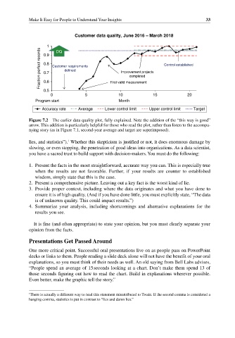
Customer data quality, June 2016 – March 2018
1 DQ
Fraction perfect records 0.8 Customer requirements Improvement projects Control established
0.9
defined
0.7
completed
0.6
0.5 First valid measurement
0 5 10 15 20
Program start Month
Accuracy rate Average Lower control limit Upper control limit Target
Figure 7.2 The earlier data quality plot, fully explained. Note the addition of the “this way is good”
arrow. This addition is particularly helpful for those who read the plot, rather than listen to the accompa-
nying story (as in Figure 7.1, second‐year average and target are superimposed).
1
lies, and statistics”). Whether this skepticism is justified or not, it does enormous damage by
slowing, or even stopping, the penetration of good ideas into organizations. As a data scientist,
you have a sacred trust to build support with decision‐makers. You must do the following:
1. Present the facts in the most straightforward, accurate way you can. This is especially true
when the results are not favorable. Further, if your results are counter to established
wisdom, simply state that this is the case.
2. Present a comprehensive picture. Leaving out a key fact is the worst kind of lie.
3. Provide proper context, including where the data originates and what you have done to
ensure it is of high quality. (And if you have done little, you must explicitly state, “The data
is of unknown quality. This could impact results.”)
4. Summarize your analysis, including shortcomings and alternative explanations for the
results you see.
It is fine (and often appropriate) to state your opinion, but you must clearly separate your
opinion from the facts.
Presentations Get Passed Around
One more critical point. Successful oral presentations live on as people pass on PowerPoint
decks or links to them. People reading a slide deck alone will not have the benefit of your oral
explanations, so you must think of their needs as well. An old saying from Bell Labs advises,
“People spend an average of 15 seconds looking at a chart. Don’t make them spend 13 of
those seconds figuring out how to read the chart. Build in explanations wherever possible.
Even better, make the graphic tell the story.”
1 There is actually a different way to read this statement misattributed to Twain. If the second comma is considered a
hanging comma, statistics is put in contrast to “lies and damn lies.”