
Page 67 - The Real Work Of Data Science Turning Data Into Information, Better Decisions, And Stronger Organizations by Ron S. Kenett, Thomas C. Redman (z-lib.org)_Neat
P. 67
56 The Real Work of Data Science
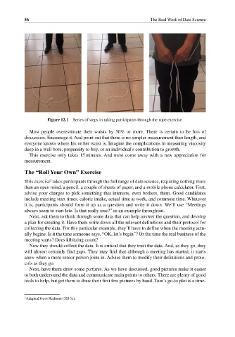
Figure 12.1 Series of steps in taking participants through the rope exercise.
Most people overestimate their waists by 50% or more. There is certain to be lots of
discussion. Encourage it. And point out that there is no simpler measurement than length, and
everyone knows where his or her waist is. Imagine the complications in measuring viscosity
deep in a well bore, propensity to buy, or an individual’s contribution to growth.
This exercise only takes 15 minutes. And most come away with a new appreciation for
measurement.
The “Roll Your Own” Exercise
2
This exercise takes participants through the full range of data science, requiring nothing more
than an open mind, a pencil, a couple of sheets of paper, and a mobile phone calculator. First,
advise your charges to pick something that interests, even bothers, them. Good candidates
include meeting start times, caloric intake, actual time at work, and commute time. Whatever
it is, participants should form it up as a question and write it down. We’ll use “Meetings
always seem to start late. Is that really true?” as an example throughout.
Next, ask them to think through some data that can help answer the question, and develop
a plan for creating it. Have them write down all the relevant definitions and their protocol for
collecting the data. For this particular example, they’ll have to define when the meeting actu-
ally begins. Is it the time someone says, “OK, let’s begin”? Or the time the real business of the
meeting starts? Does kibitzing count?
Now they should collect the data. It is critical that they trust the data. And, as they go, they
will almost certainly find gaps. They may find that although a meeting has started, it starts
anew when a more senior person joins in. Advise them to modify their definitions and proto-
cols as they go.
Next, have them draw some pictures. As we have discussed, good pictures make it easier
to both understand the data and communicate main points to others. There are plenty of good
tools to help, but get them to draw their first few pictures by hand. Tom’s go‐to plot is a time‐
2 Adapted from Redman (2013e).