
Page 68 - The Real Work Of Data Science Turning Data Into Information, Better Decisions, And Stronger Organizations by Ron S. Kenett, Thomas C. Redman (z-lib.org)_Neat
P. 68
Teach, Teach, Teach 57
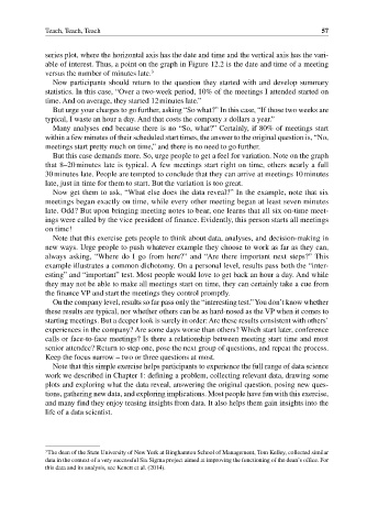
series plot, where the horizontal axis has the date and time and the vertical axis has the vari-
able of interest. Thus, a point on the graph in Figure 12.2 is the date and time of a meeting
versus the number of minutes late. 3
Now participants should return to the question they started with and develop summary
statistics. In this case, “Over a two‐week period, 10% of the meetings I attended started on
time. And on average, they started 12 minutes late.”
But urge your charges to go further, asking “So what?” In this case, “If those two weeks are
typical, I waste an hour a day. And that costs the company x dollars a year.”
Many analyses end because there is no “So, what?” Certainly, if 80% of meetings start
within a few minutes of their scheduled start times, the answer to the original question is, “No,
meetings start pretty much on time,” and there is no need to go further.
But this case demands more. So, urge people to get a feel for variation. Note on the graph
that 8–20 minutes late is typical. A few meetings start right on time, others nearly a full
30 minutes late. People are tempted to conclude that they can arrive at meetings 10 minutes
late, just in time for them to start. But the variation is too great.
Now get them to ask, “What else does the data reveal?” In the example, note that six
meetings began exactly on time, while every other meeting began at least seven minutes
late. Odd? But upon bringing meeting notes to bear, one learns that all six on‐time meet-
ings were called by the vice president of finance. Evidently, this person starts all meetings
on time!
Note that this exercise gets people to think about data, analyses, and decision‐making in
new ways. Urge people to push whatever example they choose to work as far as they can,
always asking, “Where do I go from here?” and “Are there important next steps?” This
example illustrates a common dichotomy. On a personal level, results pass both the “inter-
esting” and “important” test. Most people would love to get back an hour a day. And while
they may not be able to make all meetings start on time, they can certainly take a cue from
the finance VP and start the meetings they control promptly.
On the company level, results so far pass only the “interesting test.” You don’t know whether
these results are typical, nor whether others can be as hard‐nosed as the VP when it comes to
starting meetings. But a deeper look is surely in order: Are these results consistent with others’
experiences in the company? Are some days worse than others? Which start later, conference
calls or face‐to‐face meetings? Is there a relationship between meeting start time and most
senior attendee? Return to step one, pose the next group of questions, and repeat the process.
Keep the focus narrow – two or three questions at most.
Note that this simple exercise helps participants to experience the full range of data science
work we described in Chapter 1: defining a problem, collecting relevant data, drawing some
plots and exploring what the data reveal, answering the original question, posing new ques-
tions, gathering new data, and exploring implications. Most people have fun with this exercise,
and many find they enjoy teasing insights from data. It also helps them gain insights into the
life of a data scientist.
3 The dean of the State University of New York at Binghamton School of Management, Tom Kelley, collected similar
data in the context of a very successful Six Sigma project aimed at improving the functioning of the dean’s office. For
this data and its analysis, see Kenett et al. (2014).