
Page 280 - ABCTE Study Guide_Neat
P. 280
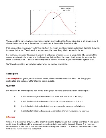
The peak of the curve is where the mean, median, and mode all lie. Remember, this is a histogram, so it
        shows that more values in the set are concentrated in the middle than in the tails.

        Pick any point on the curve. The farther it is from the mean (and the median and mode), the less likely it is
        to appear in the set. The closer it is to the mean, the more likely it is to appear in the set.

        For example, suppose this curve is actually a histogram of exam scores in your class. Then most of the
        scores are close to the mean, and the fewest are farthest from the mean. In other words, suppose the
        mean of the test is 86. Then it is more likely that a student received a grade of 80 than a grade of 50.

        We’ll look back at the normal distribution when we explore probability.


        Scatterplots


        A scatterplot is a graph, or collection of points, of two-variable numerical data. Like line graphs,
        scatterplots are quite useful for showing trends in data.


        Question

        For which of the following data sets would a line graph be more appropriate than a scatterplot?


                 A        A set of data that gives the altitude of a plane as it descends to a runway


                 B        A set of data that gives the ages of all of the principals in a school district

                 C        A set of data that gives the height and arm span of a classroom of students


                 D        A set of data that gives the annual sales for ten different restaurants for one year


          Answer


        Choice A is the correct answer. A line graph is used to display values that change over time. A line graph
        could show the altitude of the airplane at several points throughout its descent. Choice B is incorrect,
        because data of this kind is best represented in a histogram. Choice C is incorrect, because data of this
        kind is best represented in a scatterplot.