
Page 346 - Essencials of Sociology
P. 346
Aging in Global Perspective 319
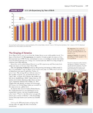
FIGURE 10.11 U.S. Life Expectancy by Year of Birth
90
81.1 81.9
79.3
80 77.4 78.8 76.2 77.1
Men 73.1 74.7 74.1
Women 71.1 70.0 71.8
70 66.6 67.1
65.2 65.6
61.6 60.8
60 58.1
53.6 54.6
51.8
50 46.3 48.3 48.4
Age
40
30
20
10
0
1900 1910 1920 1930 1940 1950 1960 1970 1980 1990 2000 2010 2020
Year
Sources: By the author. Based on Historical Statistics of the United States, Colonial Times to 1970, Bicentennial Edition, Part I, Series B, 107–115; Statistical
Abstract of the United States 2013:Table 108.
life expectancy the number of
years that an average person at
any age, including newborns, can
The Graying of America expect to live
From Figure 10.11, you can see how the United States is part of this global trend. This graying of America the growing
figure shows how U.S. life expectancy, the number of years people can expect to live, percentage of older people in the
has increased since 1900. To me, and perhaps to you, it is startling to realize that a little U.S. population
over a hundred years ago, the average U.S. woman and man didn’t live long enough to
celebrate their 50th birthday. Except for interaction within families,
Since then, we’ve added about 30 years to our life expectancy, and Americans born age groups in Western culture are
today can expect to live into their 70s or 80s. usually kept fairly separate. The idea
The term graying of America refers to this growing percentage of older people in of having a day care center in the
the U.S. population. Look at Figure 10.12 on the next page. In 1900, only 4 percent same building as a nursing home
breaks this tradition. This photo was
of Americans were age 65 and older. Today, 13 taken in Seattle, Washington.
percent are. The average 65-year-old can expect to
live another 19 years. U.S. society has become so
“gray” that, as Figure 10.13 shows, the median age
has almost doubled since 1850. Today, there are 12
million more elderly Americans than there are teen-
agers (Statistical Abstract 2013:Tables 11, 107).
Despite this vast change, as Figure 10.14 on page
321 shows, the United States ranks just eleventh in
life expectancy on a global level.
As anyone who has ever visited Florida knows,
the elderly population is not distributed evenly
around the country. (As Jerry Seinfeld sardoni-
cally noted, “There’s a law that when you get old,
you’ve got to move to Florida.”) The Social Map
on the next page shows how uneven this distribu-
tion is.
Let’s see the different pictures of aging that
emerge when we apply the three theoretical
perspectives