
Page 890 - Algebra 1
P. 890
Making Line Plots
Skills Bank Lesson 29
How often a data value occurs in a data set is called its frequency. A line plot is a graph made up of a number line and columns of x’s. Other markers can be used to show a frequency. A cluster is a group of data values that are grouped together.
Making a Line Plot
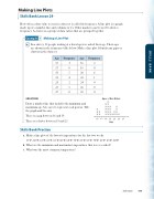
a. In a survey, 28 people waiting at a bus stop were asked their age. Their ages are shown in the frequency table below. Make a line plot. Identify any gaps or clusters in the data set.
Example
1
Age
Frequency
Age
Frequency
15
3
16
2
17
0
18
0
19
5
20
6
21
4
22
1
23
2
24
4
25
1
26
0
27
0
28
0
SOLUTION
Draw a number line that includes the minimum and maximum age. Use an x to represent each person. Title the graph and the axis.
There is a gap between 16 and 19. There is a cluster between 19 and 25.
Skills Bank Practice
a. Make a line plot of the lowest temperatures for the last two weeks.
55°F, 60°F, 65°F, 65°F, 65°F, 60°F, 60°F, 70°F, 65°F, 65°F, 70°F, 65°F, 65°F, 60°F b. What are the minimum and maximum temperatures that were recorded?
c. What was the most common temperature?
X
X X X X
Ages of Bus Riders
X X X
X X X X X X X X
X X X X
X XX
X X X X X
15 17 19 21 23 25 27
Age
Skills Bank 875
SKILLS BANK
