
Page 65 - HBR's 10 Must Reads 20180 - The Definitive Management Ideas of the Year from Harvard Business Review
P. 65
BERINATO
Because we don’t know what we’re looking for, these visuals tend
to plot data more inclusively. In extreme cases, this kind of project
may combine multiple data sets or load dynamic, real-time data into
a system that updates automatically. Statistical modeling benefits
from visual exploration.
Exploration also lends itself to interactivity: Managers can adjust
parameters, inject new data sources, and continually revisualize.
Complex data sometimes also suits specialized and unusual visu-
alization, such as force-directed diagrams that show how networks
cluster, or topographical plots.
Function trumps form here: Analytical, programming, data manage-
ment, and business intelligence skills are more crucial than the ability
to create presentable charts. Not surprisingly, this half of the quadrant is
where managers are most likely to call in experts to help set up systems
to wrangle data and create visualizations that fit their analytic goals.
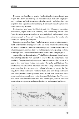
Anmol Garg, a data scientist at Tesla Motors, has used visual explo-
ration to tap into the vast amount of sensor data the company’s cars
produce. Garg created an interactive chart that shows the pressure in
a car’s tires over time. In true exploratory form, he and his team first
created the visualizations and then found a variety of uses for them:
to see whether tires are properly inflated when a car leaves the fac-
tory, how often customers reinflate them, and how long customers
take to respond to a low-pressure alert; to find leak rates; and to do
some predictive modeling on when tires are likely to go flat. The pres-
sure of all four tires is visualized on a scatter plot, which, however
inscrutable to a general audience, is clear to its intended audience.
49