
Page 46 - HTML5 Notes for Professionals
P. 46
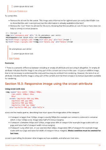
Lorem ipsum dolor sed.

           Edit icon / Delete icon

       To correct this:


             Remove the alt-text for the avatar. This image adds information for sighted users (an easily identifiable icon
             to show that the user is anonymous) but this information is already available in the text.1
             Remove the "icon" from the alt-text for the icons. Knowing that this would be an icon if it were there does not
             help to convey its actual purpose.

       <!-- Correct -->
       <img src="anonymous.png" alt=""/> An anonymous user wrote:
       <blockquote>Lorem ipsum dolor sed.</blockquote>
       <a href="https://google.com/"><img src="edit.png" alt="Edit"/></a> /
       <a href="https://google.com/"><img src="delete.png" alt="Delete"/></a>


           An anonymous user wrote:

                Lorem ipsum dolor sed.

           Edit / Delete

       Footnotes


       1 There is a semantic difference between including an empty alt attribute and excluding it altogether. An empty alt
       attribute indicates that the image is not a key part of the content (as is true in this case - it's just an additive image
       that is not necessary to understand the rest) and thus may be omitted from rendering. However, the lack of an alt
       attribute indicates that the image is a key part of the content and that there simply is no textual equivalent available
       for rendering.

       Section 15.3: Responsive image using the srcset attribute


       Using srcset with sizes
       <img sizes="(min-width: 1200px) 580px,
             (min-width: 640px) 48vw,
             98vw"
           srcset="img/hello-300.jpg 300w,
             img/hello-600.jpg 600w,
             img/hello-900.jpg 900w,
             img/hello-1200.jpg 1200w"
           src="img/hello-900.jpg" alt="hello">

       sizes are like media queries, describing how much space the image takes of the viewport.

             if viewport is larger than 1200px, image is exactly 580px (for example our content is centered in container
             which is max 1200px wide. Image takes half of it minus margins).
             if viewport is between 640px and 1200px, image takes 48% of viewport (for example image scales with our
             page and takes half of viewport width minus margins).
             if viewport is any other size , in our case less than 640px, image takes 98% of viewport (for example image
             scales with our page and takes full width of viewport minus margins). Media condition must be omitted for
             last item.

       srcset is just telling the browser what images we have available, and what are their sizes.


       GoalKicker.com – HTML5 Notes for Professionals                                                           39
