
Page 50 - HTML5 Notes for Professionals
P. 50
Chapter 17: Input Control Elements
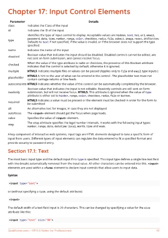
Parameter Details
class Indicates the Class of the input
id Indicates the ID of the input
Identifies the type of input control to display. Acceptable values are hidden, text, tel, url, email,
password, date, time, number, range, color, checkbox, radio, file, submit, image, reset, and button.
type
Defaults to text if not specified, if the value is invalid, or if the browser does not support the type
specified.
name Indicates the name of the input
Boolean value that indicates the input should be disabled. Disabled controls cannot be edited, are
disabled
not sent on form submission, and cannot receive focus.
When the value of the type attribute is radio or checkbox, the presence of this Boolean attribute
checked
indicates that the control is selected by default; otherwise it is ignored.
multiple HTML5 Indicates multiple files or values can be passed (Applies only to file and email type inputs )
HTML5 A hint to the user of what can be entered in the control . The placeholder text must not
placeholder
contain carriage returns or line-feeds
autocomplete HTML5 Indicates whether the value of the control can be automatically completed by the browser.
Boolean value that indicates the input is not editable. Readonly controls are still sent on form
readonly submission, but will not receive focus. HTML5: This attribute is ignored when the value of type
attribute is either set to hidden, range, color, checkbox, radio, file or button.
HTML5 Indicates a value must be present or the element must be checked in order for the form to
required
be submitted
alt An alternative text for images, in case they are not displayed.
autofocus The <input> element should get the focus when page loads.
value Specifies the value of <input> element.
The step attribute specifies the legal number intervals. It works with the following input types:
step
number, range, date, datetime-local, month, time and week.
A key component of interactive web systems, input tags are HTML elements designed to take a specific form of
input from users. Different types of input elements can regulate the data entered to fit a specified format and
provide security to password entry.
Section 17.1: Text
The most basic input type and the default input if no type is specified. This input type defines a single-line text field
with line-breaks automatically removed from the input value. All other characters can be entered into this. <input>
elements are used within a <form> element to declare input controls that allow users to input data.
Syntax
<input type="text">
or (without specifying a type, using the default attribute):
<input>
The default width of a text field input is 20 characters. This can be changed by specifying a value for the size
attribute like this:
<input type="text" size="50">
GoalKicker.com – HTML5 Notes for Professionals 43
