
Page 21 - Demo
P. 21
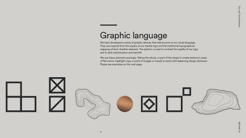
   Graphic language
We have developed a series of graphic devices that add accents to our visual language. They are inspired from the square of our master logo and the traditional topographical mapping of land. Another element, ‘the sphere’, is used to contrast the rigidity of our logo and to add sophistication and warmth.
We use these elements sparingly. Taking the whole, or part of the shape to create texture in areas of flat colour, highlight copy or parts of images or simply to assist with balancing design elements. Please see examples on the next page.
           21
This LandTM Brand Guidelines DEC 2017. V1
