
Page 10 - The MILConnection: Winter 2022
P. 10
Visualizing the impact of Creating Impactful Visualizations
Several federal agencies have published outstanding
government accountability visualizations for the public on their websites. These
visualizations clearly tie the dollars that are appropriated,
By Paul Marshall, Vice President budgeted, and spent to the mission outcomes and goals. For
example, the U.S. Agency for International Development
They say seeing is believing, a picture is worth a thousand
(USAID) has multiple websites utilizing visualizations
words, show me don’t tell me…they are all right! Many of us
to allow users to drill down into how their funds support
in the accountability community love a good spreadsheet and
projects worldwide. The Foreign Aid Explorer (FAE), which is
can number crunch all day long, but there’s really nothing
also available as a link (explorerdev.usaid.gov) in the agency’s
that can tell you a story faster and more succinctly than a
Annual Financial Report (AFR), provides multi-dimensional
picture. Dashboards are nothing new, federal organizations
pictures of U.S. foreign assistance through a highly interactive
have been using products like Tableau, PowerBI, Qlik, and
website. Interactive maps and graphics display the historical
many others to create dashboards and visualizations for
details of U.S. foreign assistance from 1946 to the present.
years. The technology is out there, it’s more user friendly than
USAID’s Dollars to Results visualizes USAID foreign-
ever, and it’s flexible – you can display visualizations via the
assistance spending and results in many of the countries
applications themselves on websites, SharePoint pages, or
where USAID works.
mobile apps.
So the question is - how can agencies use all this available A third incredible website is the Treasury’s Data Lab, where
financial and program data to illustrate the impact on publicly available financial and program data is analyzed and
customers and citizens? Let’s take a look at some impactful visualized to tell a story and show how multiple agencies and
visualizations below. federal programs make an impact.
Another great example is Treasury’s America’s Finance
Guide. This site clearly shows the multiple sources of federal
revenue, how funds are spent, the deficit, and the debt.
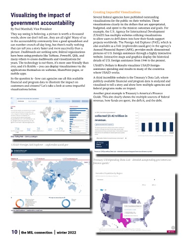
USAID Foreign Aid Explorer – exploredev.usaid.gov
Treasury USASpending Data Lab - datalab.usaspending.gov/americas-
finance-guide/
10 | the MIL connection | winter 2022