
Page 42 - brand_book_donna_italia
P. 42
02 BRAND GUIDE LINES & 4.1 Corporate Logo 4.5 Grid Systems 43 // 98
STRATEGY 4.2 Corporate Typography 4.6 Corporate Images
4.3 Corporate Color System 4.7 Iconography
4.4 Corporate Stationary 4.8 DI Online
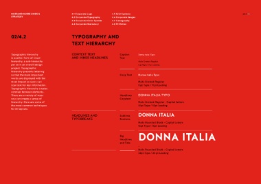
02/4.2 TYPOGRAPHY AND
TEXT HIERARCHY
Typographic hierarchy CONTEXT TEXT Caption Donna Italia Typo
is another form of visual AND INNER HEADLINES Text -
hierarchy, a sub-hierarchy Halis Grotesk Regular
per se in an overall design 6 pt Type / 9 pt Leading
project. Typographic
hierarchy presents lettering
so that the most important Copy Text Donna Italia Typo
words are displayed with the -
most impact so users can Halis Grotesk Regular
scan text for key information. 8 pt Type / 11 pt Leading
Typographic hierarchy creates
contrast between elements.
There are a variety of ways Headlines DONNA ITALIA TYPO
you can create a sense of Copytext -
hierarchy. Here are some of Halis Grotesk Regular - Capital Letters
the most common techniques 10pt Type / 10pt Leading
for DI layouts.
HEADLINES AND Sublines DONNA ITALIA
TYPOBREAKS Sections -
Halis Rounded Black - Capital Letters
16pt Type / 16pt Leading
DONNA ITALIA
Big
Headlines
and Title
-
Halis Rounded Black - Capital Letters
34pt Type / 30 pt Leading