
Page 38 - brand_book_donna_italia
P. 38
02 BRAND GUIDE LINES & 4.1 Corporate Logo 4.5 Grid Systems 39 // 98
STRATEGY 4.2 Corporate Typography 4.6 Corporate Images
4.3 Corporate Color System 4.7 Iconography
4.4 Corporate Stationary 4.8 DI Online
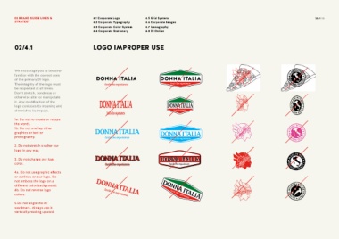
02/4.1 LOGO IMPROPER USE
We encourage you to become
familiar with the correct uses
of the primary DI logo.
The integrity of the logo must
be respected at all times.
Don’t stretch, condense or
otherwise alter or manipulate
it. Any modification of the
logo confuses its meaning and
diminishes its impact.
1a. Do not re-create or retype
the words.
1b. Do not overlap other
graphics or text or
photography.
2. Do not stretch or alter our
logo in any way.
3. Do not change our logo
color.
4a. Do not use graphic effects
or outlines on our logo. Do
not emboss the logo on a
different color background.
4b. Do not reverse logo
colors.
5.Do not angle the DI
wordmark. Always use it
vertically reading upward.