
Page 7 - TCHD brochure #1
P. 7
Three - Text
Correctly presented text is essential.....
Capitals should only be used for initial letters and type must be clear
and without (sans) serifs. Century Gothic (the font I’m using here) is an
excellent example and the larger the text can be, the better.
N.B. Reading is a more complex process than it first appears, so it’s useful to
appreciate that when we learn to read we focus on the sounds and shapes
of the individual letters, but as our competence develops we use familiarity
of the shape of words instead. Using block capitals makes every word the
same shape and therefore hard to read.
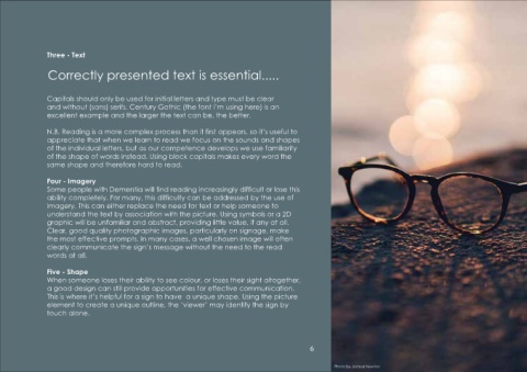
Four - Imagery
Some people with Dementia will find reading increasingly difficult or lose this
ability completely. For many, this difficulty can be addressed by the use of
imagery. This can either replace the need for text or help someone to
understand the text by association with the picture. Using symbols or a 2D
graphic will be unfamiliar and abstract, providing little value, if any at all.
Clear, good quality photographic images, particularly on signage, make
the most effective prompts. In many cases, a well chosen image will often Photo by Cristian Newman
clearly communicate the sign’s message without the need to the read
words at all.
Five - Shape
When someone loses their ability to see colour, or loses their sight altogether,
a good design can still provide opportunities for effective communication.
This is where it’s helpful for a sign to have a unique shape. Using the picture
element to create a unique outline, the ‘viewer’ may identify the sign by
touch alone.
6
Photo by Joshua Newton