
Page 29 - Data Visualization aligned
P. 29
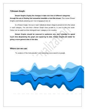
7)Stream Graph:


                       Stream Graphs display the changes in data over time of different categories

               through the use of flowing that somewhat resemble a river-like stream. This makes Stream
               Graphs aesthetically pleasing and more engaging to look at.


                       In a Stream Graph, the size of each individual stream shape is proportional to the values
               in each category. The axis that a Stream Graph flows parallel to, is used for the time scale.
               Colour can be used to either distinguish each category or to visualize


                       Stream  Graphs  should  be  reserved  to  audiences  who  don't  intended  to  spend
               much time deciphering the graph and exploring its data. Stream Graphs are better for

               giving a more general view of the data.


               Where can we use:


                        To analysis of the most prevalent and interesting topics search on google.