Page 28 - FASTSIGNS Case Study Book
P. 28
The Children’s
            Assessment Center                                       HEALTHCARE AND SOCIAL ASSISTANCE


            Inviting Visuals Create a Welcoming Space for Children

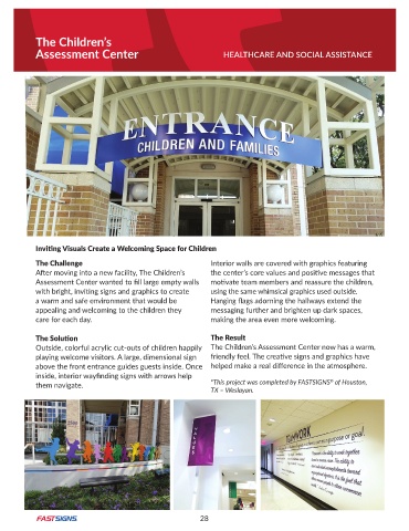
            The Challenge                                       Interior walls are covered with graphics featuring
            After moving into a new facility, The Children’s    the center’s core values and positive messages that
            Assessment Center wanted to fill large empty walls   motivate team members and reassure the children,
            with bright, inviting signs and graphics to create   using the same whimsical graphics used outside .
            a warm and safe environment that would be           Hanging flags adorning the hallways extend the
            appealing and welcoming to the children they        messaging further and brighten up dark spaces,
            care for each day .                                 making the area even more welcoming .

            The Solution                                        The Result
            Outside, colorful acrylic cut-outs of children happily  The Children’s Assessment Center now has a warm,
            playing welcome visitors . A large, dimensional sign   friendly feel. The creative signs and graphics have
            above the front entrance guides guests inside . Once  helped make a real difference in the atmosphere.
            inside, interior wayfinding signs with arrows help
                                                                                                    ®
            them navigate .                                     *This project was completed by FASTSIGNS  of Houston,
                                                                TX – Weslayan.


                                                             28

