Page 26 - FASTSIGNS Case Study Book
P. 26
Smile Squad                                             HEALTHCARE AND SOCIAL ASSISTANCE


           New Signs and Graphics Give Company a Reason to Smile
           The Challenge                                        was painted to match the Pantone blue with vinyl
           The children’s dental offices at Smile Squad needed to be   graphics added on top .
           updated and use the same colors that already existed in the
           space for brand continuity.                          The team also created several dental-inspired wall graphics
                                                                that said “Brush,” “Floss” and “Smile.” Finally, an educational
           The Solution                                         and colorful floor-to-ceiling wall graphic was created that
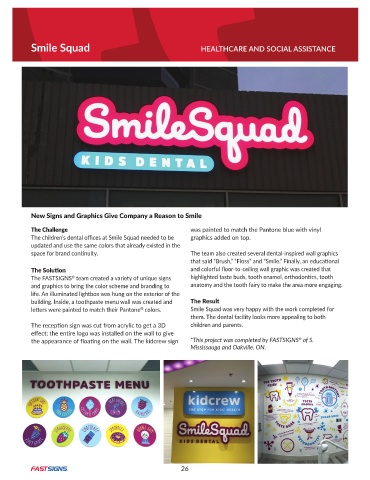
           The FASTSIGNS  team created a variety of unique signs   highlighted taste buds, tooth enamel, orthodontics, tooth
                         ®
           and graphics to bring the color scheme and branding to   anatomy and the tooth fairy to make the area more engaging .
           life . An illuminated lightbox was hung on the exterior of the
           building. Inside, a toothpaste menu wall was created and   The Result
           letters were painted to match their Pantone  colors .   Smile Squad was very happy with the work completed for
                                                ®
                                                                them . The dental facility looks more appealing to both
           The reception sign was cut from acrylic to get a 3D   children and parents .
           effect; the entire logo was installed on the wall to give
                                                                                                    ®
           the appearance of floating on the wall. The kidcrew sign   *This project was completed by FASTSIGNS  of S.
                                                                Mississauga and Oakville, ON.


                                                             26

