Page 33 - House Style of Sketching_2023_Rev3
P. 33
presentation


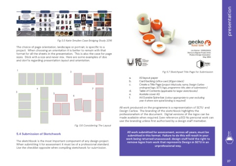
                                          Fig 5.5 Katie Smullen Case Bridging Study 2016
             The choice of page orientation, landscape or portrait, is specific to a
             project.  When choosing an orientation it is better to remain with that
             format for all the sheets in the presentation.  This is also the case for page
             sizes.  Stick with a size and never mix.  Here are some examples of dos
             and don’ts regarding presentation layout and orientation.


             1
                                                   2                                                                 Fig 5.7 Sketchpad Title Page for Submission
                                                                                             a.     A3 layout paper
                                                                                             b.     Card backing (office card 210gsm black)
                                                                                             c.     Create a Title Page (project title/code, name, Design Carlow
                                                                                                    undergrad logo, SETU logo, programme title, date of submission.)
                           4                                       7
            3                                                                                d.     Table of Contents (applicable for larger sketchbooks)
                                       5                                                     e.     Acetate cover A3
                                                     6
                                                                                             f.     A4 Durable Spine bar. (colour appropriate to year excluding
                                                                                                    year 4 where wire spiral binding is required)
                                                                                      All work produced on the programme is a representation of SETU  and
                                                                                      Design Carlow.  The branding of the sketchbook highlights the
                                                                                      professionalism of the document.  Digital versions of the logos can be
                                                                                      made available when required. (see reference p30) No personal work can
                                                                                      use the branding unless first authorised by a design staff memeber.

                                                      Fig. 5.6 Considering The Layout
                                                                                            All work submitted for assessment, across all years, must be
             5.4 Submission of Sketchwork
                                                                                            submitted in this format.  Failure to do this will result in your
                                                                                           work being returned unassessed. design staff hold the right to
             The sketchbook is the most important component of any design project.          remove logos from work that represents Design in SETU in an
             When submitting it for assessment it must be of a professional standard.                          unprofessional way.
             Use the checklist opposite when compiling sketchwork for submission.


                                                                                                                                                                   27

