
Page 5 - Ben Sweeney
P. 5
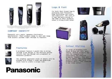
Table of Contents


                                                                                                               Logo & Font


                                                                                                               For both their brand logo &
                                                                                                               packaging font Panasonic
                                                                                                               keep everything very plain
                                                                                                               and simplistic. The lack of
                                                                                                               a logo and positioning of
                                                                                                               the name on their products
                                                                                                               shows a strong brand value.


                  COMPANY IDENTITY


                  Panasonic are a major Japanese electronics
                  manufacturer. Their product range is vast and range
                  from avionic systems right through to toasters.


                                                                                                                                             Colour Styling
                                    Features

                                                                                                                                             In terms of branding both
                                    A prominent feature I would like to bring                                                                black & blue are their main
                                    through in my design is the distinct button                                                              choice. Several products may
                                    feature that has become very prominent on                                                                vary for example oral
                                    Panasonic products.                                                                                      electronics and feminine
                                                                                                                                             products. However, they are

                                    The slightly aggresive style of wheels will be                                                           due to launch semi-translucent
                                    blended with Grange’s sleek and modernism                                                                purple kitchen appliance
                                    style form to create a unique look.                                                                      products which I feel could be
                                                                                                                                             a new trend setter.