Page 2 - LJMU Brand Guidelines 2018.indd
P. 2
LJMU BRAND GUIDELINES


              2018


           LOGO


        Whilst having undergone a brand evolution, we                                                                                                            Logo position

        have retained LJMU’s unique logo. However, to                                                                                                            The logo should always be confidently positioned in the bottom left
        ensure this sits seamlessly with a bolder and more                                                                                                       corner on the front of every document, never on the back or inside
        modern look and feel, it is important we now only                                                                                                        cover of any printed material. The only exception to this is when the
                                                                                                                                                                 logo is used digitally as the top left corner of a web page will always
        use the outline version and never a version with a                                                                                                       be the most visible position.
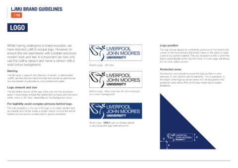
        solid colour background.                                                          Keyline Logo - 281 blue

                                                                                                                                                                 Protection zone
        Naming
                                                                                                                                                                 A protection zone should surround the logo so that no other
        The full name ‘Liverpool John Moores University’ or abbreviated                                                                                          elements or text interfere with its hierarchy. This is equivalent to
        ‘LJMU’ are the only two name formats that should be used across                                                                                          the height of the logo as shown below. For A6 documents this
        any documents or publications, both printed and digital.
                                                                                                                                                                 protection zone will be 80% of the logo height due to space
                                                                                                                                                                 limitations.
        Logo artwork and size
        The full keyline version of the logo is the only one that should be               Keyline Logo - Mono (can also be white reversed
        used. It must always include the keyline box surround and only be in              on a colour background)
        white, mono or 281 blue, depending on the background colour.


        For legibility avoid complex pictures behind logo.

        The only exception to the use of the logo is for online profiles such
        as LinkedIn and Twitter where a smaller version without the text an
        keyline box surround is suitable due to space constraints.


                                                                                           Block Logo - ONLY used on display stands
                                                                                           or as a supporter logo (web and print)


                                                                                                                                                                                                     X
                                                                                                                                                                    X


                                                                                                                                                                         X

