Page 147 - PAM - PROOF
P. 147
V 1.1 February 2024

               This is a good opportunity to have a spring clean of your current site.  As part of
               your pre-migration checklist you will be preparing your site for the move to
               SiteWorks and clearing out any old pages, photos, files, etc. that are no longer
               used as well as gathering data to populate some support functions.  You need to
               finalise this before you proceed to migration itself.

               As you plan your site it’s going to be very tempting to want to show off your new
               skills and use every possible feature you can think of on your new site.  You
               might also be tempted to splash numerous coloured backgrounds plus lots of
               coloured text of various sizes all over but sometime less is more.  There are three
               key things to consider when using colour.  Colours helps to sell a product or idea.
               Colour attracts attention.  Colour clarifies.  If adding colour to a section of your
               website supports one of these three things then use it but if it doesn’t then ask
               yourself why you are doing it.

               It’s worth remembering who you’re creating this for.  Many of our members are
               getting on a bit and very unsure of themselves when using a computing device
               for anything at all so we need to keep this as simple as possible but make an
               impact at the same time.  We want to attract new members but if our website is
               too complex and they can’t find their way around easily then they won’t use it.
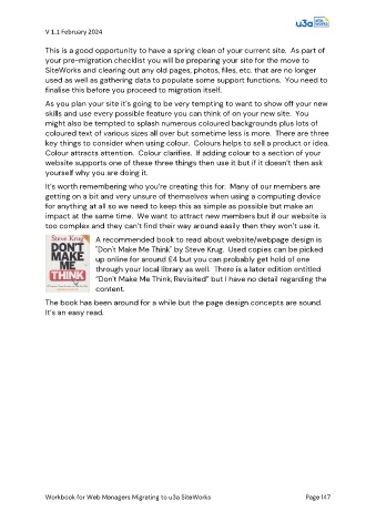
                               A recommended book to read about website/webpage design is
                               "Don't Make Me Think" by Steve Krug.  Used copies can be picked
                               up online for around £4 but you can probably get hold of one
                               through your local library as well.  There is a later edition entitled
                               “Don't Make Me Think, Revisited” but I have no detail regarding the
                               content.

               The book has been around for a while but the page design concepts are sound.
               It’s an easy read.


               Workbook for Web Managers Migrating to u3a SiteWorks                               Page 147

