Page 441 - Krugmans Economics for AP Text Book_Neat
P. 441
figure 40.1                  Actual and Potential Output from 1989 to 2009


                  Real GDP
                 (billions of
                2005 dollars)                                                                           Potential
                                                                                                         output
                     $14,000
                      13,000                          Actual aggregate output                            Actual
                      12,000                          exceeds potential output.                        aggregate
                                                                                                         output
                      11,000   Potential output exceeds
                               actual aggregate output.
                      10,000
                      9,000
                      8,000
                      7,000
                                            Actual aggregate output roughly
                      6,000                 equals potential output.


                         1989  1990  1991  1992  1993  1994  1995  1996  1997  1998  1999  2000  2001  2002  2003  2004  2005  2006  2007  2008  2009  2010
                                                                                                              Year


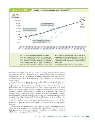
                           This figure shows the performance of actual and potential   years are periods in which actual aggregate output exceeded
                           output in the United States from 1989 to 2009. The black line  potential output. As shown, significant shortfalls occurred in the
                           shows estimates, produced by the Congressional Budget Office,  recessions of the early 1990s and after 2000. Actual aggregate
                           of U.S. potential output. The blue line shows actual aggregate  output was significantly above potential output in the boom of
                           output. The purple-shaded years are periods in which actual ag-  the late 1990s.
                           gregate output fell below potential output, and the green shaded  Sources: Congressional Budget Office, Bureau of Economic Analysis.


             trade-off between producing fish and coconuts. Looking at Figure 40.2 on the next
             page, we see that economic growth is shown as an outward shift of the production pos-
             sibilities curve. Now let’s return to the production possibilities curve model and use a
             different example to illustrate how economic growth policies can lead to long-run eco-
             nomic growth.
               Figure 40.3 on the next page shows a hypothetical production possibilities curve
             for a fictional country we’ll call Kyland. In our previous production possibilities ex-
             amples, the trade-off was between producing quantities of two different goods. In
             this example, our production possibilities curve illustrates Kyland’s trade-off be-
             tween two different categories of goods. The production possibilities curve shows the
             alternative combinations of investment goods and consumer goods that Kyland can
             produce. The consumer goods category includes everything purchased for consump-
             tion by households, such as food, clothing, and sporting goods. Investment goods in-
             clude all forms of physical capital. That is, goods that are used to produce other
             goods. Kyland’s production possibilities curve shows the trade-off between the pro-
             duction of consumer goods and the production of investment goods. Recall that the
             bowed-out shape of the production possibilities curve reflects increasing opportu-
             nity cost.
               Kyland’s production possibilities curve shows all possible combinations of con-
             sumer and investment goods that can be produced with full and efficient use of all of
             Kyland’s resources. However, the production possibilities curve model does not tell us
             which of the possible points Kyland should select.


                                              module 40       Economic Growth in Macroeconomic Models           399

