
Page 31 - Allison's Magazine ~ Issue #101
P. 31
used bright teal paint on the fireplace
to update it, added a lot of color and a
printed grass cloth on the walls to make
it feel a little more casual, and mixed in
more traditional furniture and light-
colored window treatments.
What other rooms or spaces were
your favorites to design?
I love the staircase because of its
ample light and because I love Gracie
wallpaper, a hand-painted wallpaper
that requires a lot of time perfecting and
antiquing. It’s a great connector between
the original part of the house and the
new part of the house.
I also love the kitchen and the
mudroom. The kitchen feels
indestructible—we salvaged the beams
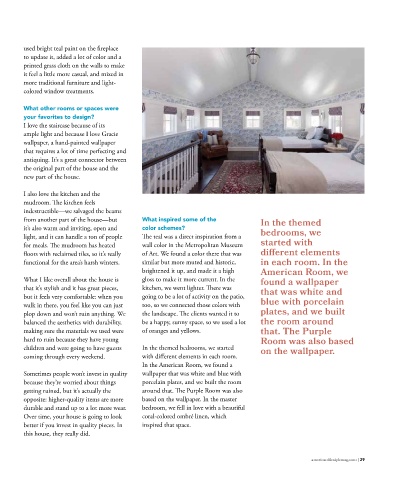
from another part of the house—but What inspired some of the
it’s also warm and inviting, open and color schemes? In the themed
light, and it can handle a ton of people The teal was a direct inspiration from a bedrooms, we
for meals. The mudroom has heated wall color in the Metropolitan Museum started with
floors with reclaimed tiles, so it’s really of Art. We found a color there that was different elements
functional for the area’s harsh winters. similar but more muted and historic, in each room. In the
brightened it up, and made it a high American Room, we
What I like overall about the house is gloss to make it more current. In the found a wallpaper
that it’s stylish and it has great pieces, kitchen, we went lighter. There was
but it feels very comfortable: when you going to be a lot of activity on the patio, that was white and
walk in there, you feel like you can just too, so we connected those colors with blue with porcelain
plop down and won’t ruin anything. We the landscape. The clients wanted it to plates, and we built
balanced the aesthetics with durability, be a happy, sunny space, so we used a lot the room around
making sure the materials we used were of oranges and yellows. that. The Purple
hard to ruin because they have young Room was also based
children and were going to have guests In the themed bedrooms, we started
coming through every weekend. with different elements in each room. on the wallpaper.
In the American Room, we found a
Sometimes people won’t invest in quality wallpaper that was white and blue with
because they’re worried about things porcelain plates, and we built the room
getting ruined, but it’s actually the around that. The Purple Room was also
opposite: higher-quality items are more based on the wallpaper. In the master
durable and stand up to a lot more wear. bedroom, we fell in love with a beautiful
Over time, your house is going to look coral-colored ombré linen, which
better if you invest in quality pieces. In inspired that space.
this house, they really did.
28 | AMERICAN LIFESTYLE MAGAZINE americanlifestylemag.com | 29