
Page 31 - AV Presentations - Student Textbook
P. 31
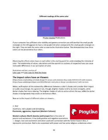
Different readings of the same color


                                                 ©Color Voodoo Publications

               If your computer has sufficient color stability and gamma correction you will see that the small purple
               rectangle on the left appears to have a red-purple tint when compared to the small purple rectangle on
               the right. They are both the same color as seen in the illustration below. This demonstrates how three
               colors can be perceived as four colors.


               Observing the effects colors have on each other is the starting point for understanding the relativity of
               color. The relationship of values, saturations and the warmth or coolness of respective hues can cause
               noticeable differences in our perception of color.

               Illustrations and text, courtesy of
               Color Logic and Color Logic for Web Site Design

               The impact colors have on Viewers
               (https://www.creativebloq.com/web-design/12-colours-and-emotions-they-evoke-61515112/2) with revisions
               (https://www.webdesignerdepot.com/2012/06/color-and-cultural-design-considerations/ ) with revisions

               Below, we'll explain all the noteworthy differences between a color’s shades and consider their impact
               on audio-visual design. As a general rule, though, brighter shades tend to be more energetic, while
               darker shades feel more relaxing. The brighter shades of calls-to-action attract the eye, while the darker
               shades in backgrounds help create an immersive effect.

               Now on to the impact of different colors on viewers...


               1. Red
               Used here, red is playful and stimulating
               Passionate, aggressive, important (Western Cultures)

               Western cultures (North America and Europe) Red is the color of
               passion and excitement. It has both positive and negative associations
               — danger, love and excitement and when used with connection with the former Eastern bloc, it
               represents communism. Red is also associated with power and has some religious undertones when


                                                             30