
Page 162 - Towards A Sustainable Future 2024
P. 162
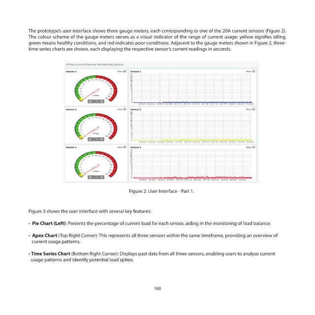
The prototype’s user interface shows three gauge meters, each corresponding to one of the 20A current sensors (Figure 2).
            The colour scheme of the gauge meters serves as a visual indicator of the range of current usage: yellow signifies idling,
            green means healthy conditions, and red indicates poor conditions. Adjacent to the gauge meters shown in Figure 2, three-
            time series charts are shown, each displaying the respective sensor’s current readings in seconds.


                                                    Figure 2: User Interface - Part 1.


            Figure 3 shows the user interface with several key features:
            •  Pie Chart (Left): Presents the percentage of current load for each sensor, aiding in the monitoring of load balance.


            •  Apex Chart (Top Right Corner): This represents all three sensors within the same timeframe, providing an overview of
               current usage patterns.

            • Time Series Chart (Bottom Right Corner): Displays past data from all three sensors, enabling users to analyse current
              usage patterns and identify potential load spikes.


                                                              160