
Page 7 - SPi Global Brand Guidelines
P. 7
6 SPi Global | Brand Guidelines SPi Global | Brand Guidelines 7
The SPi Global logo The SPi Global logo: Structure
3
The SPi Global logo is a representation of the company,
its employees, products and services, and business
4 4
practices. Ultimately, it signifies our premiums and quality
as an organization, and therefore should be handled with
care and respect. 1
2
Two parts make up the SPi Global signature. These two
parts should be present together at all times.
Primary logo = full color
4 4
1
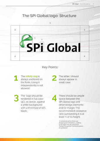
Key Points:
1 The infinity ring is 2 The letter i should
2 always anchored on always appear in
small case.
the fonts. Using it
independently is not
allowed.
1. The infinity ring symbolizes our goals, our potentials
as a team, and our drive towards innovation and The logo should be 4 There should be ample
excellence. It has a glassy and clear finish that gives 3 rendered in full color space between the
it a three-dimensional feel representative of our (4C), as above, against SPi Global logo and
conviction in Solutions. People. Innovation. a white background other design elements
with a threshold of 10% and/or margin. The
2. The balance in the namestyle was achieved by black. recommended clearance
the subliminal shapes used in the design. It was ratio surrounding it is at
especially created to complement the infinity ring least ½ of its height.
and has no similar typeface/font. Recreating it is *In instances where there are
design space limitations, visibility
strictly prohibited. of the logo may be prioritized.
Contact Corporate Communications
for guidance.