
Page 9 - SPi Global Brand Guidelines
P. 9
8 SPi Global | Brand Guidelines SPi Global | Brand Guidelines 9
Usage Restrictions
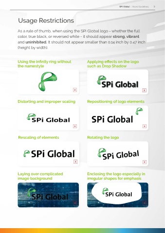
Logo Variations As a rule of thumb, when using the SPi Global logo - whether the full
color, true black, or reversed white - it should appear strong, vibrant
In earlier versions of our brand identity guidelines, several and uninhibited. It should not appear smaller than 0.14 inch by 0.47 inch
secondary variations of the SPi Global logo were acceptable (height by width).
for use. Upon careful study, the design team has narrowed it
down to two alternative colors: true black and reversed white.
This not only minimizes the risk of logo violations by internal Using the infinity ring without Applying effects on the logo
the namestyle
such as Drop Shadow
and external partners, it also ensures consistent brand
association and recall among our various audiences.
Applying the primary logo should take precedence in the
development of any collateral intended for external
communications. For projects that require co-branding,
consult the Corporate Communications Team. Distorting and improper scaling Repositioning of logo elements
The secondary logo variations may only be applied to
designs meant for internal distribution. However, for
instances where production limitations exist, such as
black & white prints or two-color newsprint ads, either
of the secondary logo variants may be used upon the Rescaling of elements Rotating the logo
approval of the Corporate Communications Team.
Secondary logo = other variations
Laying over complicated Enclosing the logo especially in
image background irregular shapes for emphasis
For designs with light colored background, true black may be applied.
For black or solid colored background, the reversed white variant may be used.