Page 97 - Jostens Yearbook_Adviser Guide
P. 97
PAGE TEMPLATES

                      Many staffs find that page templates save time, while also helping to create a consistent look and feel throughout
 4.5  CONSISTENCY     the yearbook. Before the school year starts, experienced staff members create 2–5 basic page designs for each
                      section of the yearbook, including openers and dividers. While these pages do not include finalized text or photos,
                      they incorporate style elements like:
                           ■  Headline design (including font, font size, color and placement)
 One thing that sets a first rate publication apart is design     ■  Secondary headline design and placement (including font, font size, color and placement)
 consistency. Creating a publication with its own look and feel,     ■  Location and size of dominant photo or module
 felt on all pages of that book, regardless of the content, is the     ■  Placement of feature story, if one will be included (including font and desired font size)

 goal of quality design.    ■  Placement and size of smaller supporting photos or modules
                           ■  Placement of text boxes used for captions next to each photo, including font desired size

 A publication seeking consistency will make a design     ■  Folio design, including size, font, placement of page number and any other supporting information
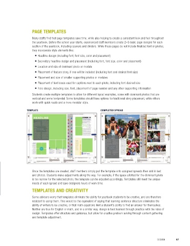
 plan, rather than having the staff make arbitrary design   Students create multiple templates to allow for different layout examples, some with dominant photos that are
 choices along the way. A design plan may include the   vertical and some horizontal. Some templates should have options for traditional story placement, while others
 use of color, typeface, folio design, and even specific   work with quick reads and a more modular style.
 modules or photo presentations. For example, one
 might choose cutouts instead of headshots or vice   TEMPLATE     COMPLETED SPREAD
 versa for quote box modules.
 Folio design is key to consistency. When looking
 at professional publication design samples, folio
 design that includes page number and content is
 commonly addressed. As a useful reference, the
 folio directs the reader through the publication, and
 is an easy design element that can be incorporated
 into all page design. The folio is also a page design
 expectation—readers anticipate seeing it from page
 to page, adding in another layer to the consistency.


                      Once the templates are created, staff members simply pull the template onto assigned spreads then add in text
 Thoughtful design can be felt on all pages   and photos. Students make adjustments along the way. For example, if the space allotted for the dominant photo

 of a book, regardless of its content.  is too narrow for the selected photo, the template can be adjusted accordingly. Templates still meet the unique
                      needs of each spread and save designers hours of work time.

                      TEMPLATES AND CREATIVITY

                      Some advisers worry that templates eliminate the ability for yearbook students to be creative, and are therefore
                      resistant to using them. This would be the equivalent of saying that learning sentence structure eliminates the
                      ability of writers to be creative, or that math equations limit a student’s ability to find an answer for themselves.
                      Neither are true for English or math, and in a similar way, design is best learned through practice with the rules of
                      design. Templates offer structure and guidance, but allow for creative problem solving through content gathering
                      and template adjustment.


 96  SECTION 4.5   CONSISTENCY                                                                        DESIGN       97

