Page 95 - Jostens Yearbook_Adviser Guide
P. 95
PROS WHO KNOW                                                                     PROS WHO KNOW

 IN THE MIDDLE        FONT PERSONALITY
 I prefer students to have a font plan.                                            Fonts convey personality, so when
 That plan can be used whether for a   When it comes to teaching type at the middle school   Fonts have personality. Some are fun. Others are serious   choosing a font (or fonts) think about
 book using a single-font strategy or a   level, make it simple. Students don’t necessarily need to   or classic or quirky or bold. The font or fonts you select   readability and the message you
 multiple-font strategy. The key is doing   know all the intricacies of type or even the various font   for your yearbook help carry the personality of your theme   want to send to the reader. San Serif
 categories. However, they often get excited by the number
 everything with a reason and purpose.   of possibilities available to them with regard to type.   throughout your yearbook.    fonts are the most readable. We are
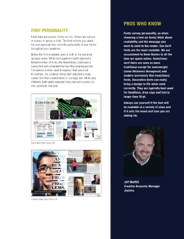
 So, I do not limit the number of fonts as   Encouraging students to stick with a minimal number of   Notice the font strategies used in both of the yearbook   accustomed to them thanks to all the
 long as there is a plan for how each one   fonts (generally no more than three) and consistent sizing   spreads below. While both yearbook staffs selected a   time we spend online. Sometimes
 will be used.   will add consistency to your publication, and a cleaner,   limited number of fonts, the Grand Blanc staff used a   serif fonts are seen as more

 Consistency is key to design, so the   more focused look.   quirky font with a handwritten feel that emphasized the   traditional except for monoweight
                      first-person stories used throughout their yearbook.
 development of a design style guide   In contrast, the Loudoun Valley staff selected a clean,   (same thickness throughout) and
 is crucial to establishing standards   A CLOSER LOOK: THE FOUR BASIC   classic font that created more of a preppy feel. While very   modern (extremely thin transitions)
 and the core look of the book. This is   CATEGORIES OF TYPE  different, both staffs selected fonts that were perfect for   fonts. Decorative fonts can really
 a free-flowing guide as the theme and   their yearbook that year.                 bring a design to life when used
 concept develops, but, eventually, this   Understanding the four basic            correctly. They are typically best used
 is the resource designers will use as                                             for headlines, drop caps and font is
 the foundation of design.   categories of type—their strengths                    larger than 18 pt.
 and limitations—can help inform the                                               Always ask yourself if the font will
 typographic decisions of a publication.                                           be readable at a variety of sizes and
                                                                                   if it sets the mood and tone you are
                                                                                   aiming for.
 Serif styles have tiny “feet” or serifs, at the
 end of each letter stroke. Common styles:
 Times Roman, New Century Schoolbook,
 Palatino and Garamond. Suggested use:
 body copy or larger passages of text.


 San Serif styles (“sans” is French
 for “without”) don’t have “feet” or serifs.   Grand Blanc High School, MI
 Common styles: Futura, Helvetica and
 Avant Garde. Suggested use: headlines,
 subheadlines and accent text.

 Mitch Eden   Script styles are meant to look like
 Publications Adviser    handwriting or cursive writing. Suggested
 Kirkwood High School, MO   use: emphasis of key word(s) in a primary
 headline. A designer should avoid using
 all-caps for script typefaces.
                                                                                    Jeff Moffitt
                                                                                    Creative Accounts Manager,
 Decorative styles, sometimes called novelty
 type, almost look like artwork. Decorative                                         Jostens
 typefaces are the least readable styles.
 Suggested use: Accent text and large sizes,   Loudoun Valley High School, VA
 18 point or greater.

