Page 93 - Jostens Yearbook_Adviser Guide
P. 93
A designer may employ reader entry points, or visual content elements that pull the viewer into the design with the   FONTS: A QUICK TUTORIAL
 goal of turning the viewer into a reader. Reader entry points increase the sophistication and visual appeal of the
 yearbook spread. The most obvious reader entry point on a spread is the dominant photograph and the spread’s   VOCABULARY
 main headline.
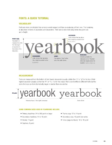
                      Fonts are more complicated than a novice would suspect and have a vocabulary all their own. Their anatomy
 Other reader entry points may include drop caps, photo identification numbers or symbols, typographic dingbats,   is described in terms of ascenders and descenders. Their size is described using terms like point size
 pulled quotes, subheadlines and copy bites.
                      and x-height.

                                                                            ASCENDER:
                                                                            Letter strokes that rise above
              POINT SIZE:                                                   the x-height as evident in the
              Typography is                                                 b, d, f, h, k, l.
              measured in points
              from the top of
 READER ENTRY POINTS IN   an ascender to
 THIS SPREAD INCLUDE:   the bottom of the
   ■  A drop cap “A” in the    descender.
 dominant feature.
   ■  Photo ID numbers and           DESCENDER:             SERIF:                       BASELINE:
 caption lead-ins that have          Letter strokes that dip below   Tiny marks or “feet” at the   Invisible guideline the
 a bold type treatment and           the x-height as evident in the                      characters sit on. Rounded
 utilize the page color palette.                            end of the letter stroke.    letters fall slightly below the
                                     g, j, p, q, y.
   ■  Triangle shaped arrow marks                                                        baseline—a, b, c, d, e, o, u.
 above images in the “Week
 Activities” module.


                      MEASUREMENT
                      Fonts are measured from the bottom of their lowest descender (usually a letter like “y” or “g”) to the top of their
 John Paul Stevens High School, MO
                      highest ascender (usually a letter like “h” or “t”). It is for this reason that a word written in different fonts but the
 WHAT’S MY TYPE?      same font size can look dramatically larger or smaller than one another.

 Font selection can be tricky because there are so many type options and ways to use them. In fact, many fonts
 come in a font family, the same font with a variety of faces including heavy, bold, italic, light, condensed, extended   yearbook yearbook
 and so on.   60 point

 It can be challenging to teach novice designers that more isn’t better, especially when it comes to fonts. Consider
 directing students toward a diverse a font family, which maintains publication consistency while at the same time   Helvetica Neue LT Std: Light Condensed  Archer: Book
 adding interest by offering a number of ways for the same font to be used.

 The use of size in design communicates importance, and type size is no exception. Larger items are interpreted
 as more important. By using different point sizes for fonts on a spread (72 points in an inch), contrast is achieved.
 The designer is also able to communicate varying degrees of importance to the reader.   SOME COMMON SIZES USED IN YEARBOOKS INCLUDE:
                           ■  Primary headlines: 24 to 200 point or larger    ■  Theme copy: 12 to 14 point
                           ■  Secondary headlines: 14 to 18 point      ■  Secondary copy: 10 point, but varies
                           ■  Stories: 10 point                        ■  Folios (page numbers): 10 to 18 point
                           ■  Captions: 8 point


 92  SECTION 4.4   TYPOGRAPHY BASICS                                                                  DESIGN       93

