Page 88 - Jostens Yearbook_Adviser Guide
P. 88
PROS WHO KNOW


                                                                                                                                                                                                              COLOR

                     4.3           MODULAR DESIGN                                                                                               By modifying photo boxes to create content modules, more      Along with typography choices, an
                                                                                                                                                topics and more students can be covered.
                                                                                                                                                The new design features 44 faces, 26 photos, 150 survey       effective color strategy helps set
                                                                                                                                                                                                              the tone of your concept. Selecting
                                                                                                                                                participants, 10 storytelling quotes and one story with       a specific color palette creates a
                                   Getting creative with coverage makes a big difference,                                                       quotes. These mods use a greater number of photos and         strong, cohesive visual trademark
                                                                                                                                                take on creative display presentations like photo montages,
                                   especially in smaller yearbooks. At the club and middle school                                               instead of a traditional single, large photo block.           that pulls the book together. Even
                                                                                                                                                                                                              a large palette can help limit your
                                   level, resources can be limited and therefore yearbooks are                                                                                                                color choices on a spread. Selecting
                                                                                                                                                PHOTO BOXES ARE MODIFIED
                                   often smaller, making every inch on every page count.                                                                                                                      headline and graphic color from
                                                                                                                                                                                                              the photos on the spread definitely
                                   Modular layouts often use several story packages, each containing copy and photos,                                                                                         increases the overall look of design,
                                   on each page or spread. With a contemporary look and feel, these designs maximize                                                                                          but the cohesiveness of the book
                                   coverage, by reaching more students on each yearbook spread and addressing a wider                                                                                         might suffer.
                                   variety of topics.


                                                    Modular design transforms standard photo blocks
                                                    into modular mini layouts. It is an effective way to

                                                    include more students on each spread.
                                                                                                                                                AFTER


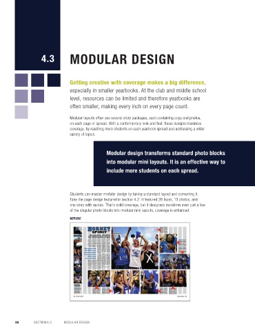
                                   Students can master modular design by taking a standard layout and converting it.
                                   Take the page design featured in section 4.2. It featured 26 faces, 13 photos, and
                                   one story with quotes. That’s solid coverage, but if designers transform even just a few
                                   of the singular photo blocks into modular mini layouts, coverage is enhanced.
                                                                                                                                                                                                              Tina Cleavelin, CJE
                                   BEFORE                                                                                                                                                                     Creative Accounts Manager,
                                                                                                                                                                                                               Jostens


                                                                                                                                                In addition to improving coverage, modular design
                                                                                                                                                also has personality, giving a publication a more modern
                                                                                                                                                feel. Stories and photos become creative design elements,
                                                                                                                                                allowing for few or many topics to be covered on each
                                                                                                                                                double-page spread. Quick Reads are employed, adding
                                                                                                                                                typographic and visual enhancement of stories with lists,
                                                                                                                                                questions/answers, data boxes and infographics.


        88       SECTION 4.3    MODULAR DESIGN

