Page 86 - Jostens Yearbook_Adviser Guide
P. 86
DON’T SKIP THIS                                                                                                                BY THE RULES: YEARBOOK DESIGN GUIDELINES


                                                                                                                                                Design work is specific work with specific standards. Here’s a cheat sheet for
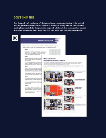
                 Even though all staff members aren’t designers, having a basic understanding of the yearbook
                 page design formula is important for everyone to understand. Taking even one class period or                                   some of the standard guidelines for yearbook design.
                 meeting to demonstrate the design creation steps will help them better understand how content                                  PHOTOGRAPHS:
                 gets added to pages and allows them to see first hand where their photos and copy ends up.
                                                                                                                                                     ■  Each spread needs a clear dominant element, whether it is one large photo or a module of
                                                                                                                                                    closely-spaced photos.
                                                                                                                                                     ■  Photos should appear in a variety of sizes and shapes: large, medium, small; tall rectangles, horizontal
                                                                                                                                                    rectangles and squares.
                                                                                                                                                     ■  Most professionals avoid shapes like stars, triangles and hearts.
                                                                                                                                                     ■  Photos should achieve variety in content including groups, individuals, close-ups and distance.
                                                                                                                                                     ■  Photos should be placed so content leads the eye into the spread rather than off the edges.

                                                                                                                                                CAPTIONS:
                                                                                                                                                     ■  Generally in 8 or 10 point type. Some club and middle school books are smaller (size 8 or 7) and can get
                                                                                                                                                    away with using as small as 7 point type for captions.
                                                                                                                                                     ■  Captions should be placed next to (above, below, left, right) the photo it is describing.
                                                                                                                                                     ■  Caption width should be consistent in individual modules, and ideally across the entire spread.
                                                                                                                                                     ■  Group captions may be used, but avoid clustering more than two summary or expanded captions together.

                                                                                                                                                STORIES:
                                                                                                                                                     ■  Generally in 10 point type. In smaller (size 7 or size 8) yearbooks, 9 point type is acceptable.

                                                                                                                                                     ■  Stories are often placed to the outside of the spread.
                                                                                                                                                     ■  Primary headline should appear with the story.

                                                                                                                                                PRIMARY HEADLINE:
                                                                                                                                                     ■  Largest type on the spread.
                                                                                                                                                     ■  In size, it can range from 24 to 200 point or even larger.
                                                                                                                                                     ■  It should be designed to employ a variety of typographic and graphic techniques.

                                                                                                                                                     ■  It should be supported with a secondary headline.

                                                                                                                                                SECONDARY HEADLINE:
                                                                                                                                                     ■  Placed above, below or beside the primary headline.
                                                                                                                                                     ■  It generally appears in 14 to 18 point type.

                                                                                                                                                PLANNED WHITE SPACE:
                                                                                                                                                     ■  Each package (or series of elements on a page) should use consistent spacing.
                                                                                                                                                     ■  Be sure to include extra space between lines of text in a story to allow for readability.

                                                                                                                                                     ■  A rail, or extra-wide space, may be used to add contrast and frame or separate packages within a page.


                                                                                                                                                                                                                                 DESIGN      87

