Page 82 - Jostens Yearbook_Adviser Guide
P. 82
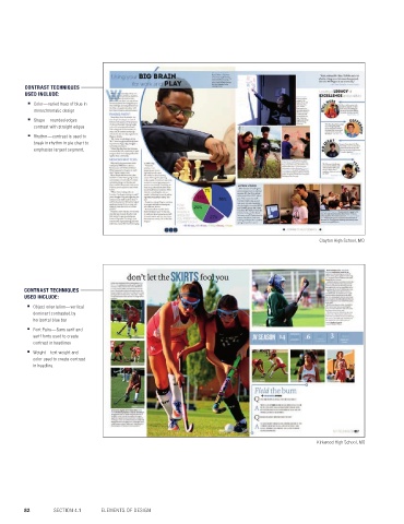
CONTRAST TECHNIQUES 10 WAYS TO ADD CONTRAST
USED INCLUDE:
■ Color—varied hues of blue in
monochromatic design
■ Shape—rounded edges
contrast with straight edges If the rule of thirds is the student favorite of photo 1
■ Rhythm—contrast is used to composition, then contrast could rival its popularity in
break in rhythm in pie chart to design. Not only is contrast easy to understand, there
emphasize largest segment. 9
are a number of simple ways to integrate it into your
design. Here are 10 ways to add contrast to designs: 2
1. Apply contrast by using opposing colors in design. Simply 7
put, dark vs. light. More specific: use complementary colors, Glenbrook South High School, IL
colors opposite from one another on the color wheel. Or
triadic colors: three colors equally spaced on the color wheel.
2. Vary text weight to create contrast. Contrast a light text
weight with heavier, more bold weight. 3
3. Use white space. Large areas of empty, or negative, space
draws emphasis to smaller elements within them, just as
Clayton High School, MO 10
small white spaces draw notice in larger content elements.
4. Contrast using a different color hue. In monochromatic
(one-color) design, use a variety of shades for emphasis.
9
5. Apply contrast with shape by opposing hard and soft. Cabot High School, AR
Rounded edges differ from those with sharp edges
and corners. 6
CONTRAST TECHNIQUES
USED INCLUDE: 6. In text or other design elements, contrast can be created 5
using size and scale.
■ Object orientation—vertical
dominant contrasted by 7. Consider using a variety of text justification: right, left, center.
horizontal blue bar
8. Apply contrast by creating a break or alternating the rhythm
■ Font Pairs—Sans serif and of a repeating pattern.
serif fonts used to create
contrast in headlines 9. Sans serif and serif fonts (fonts with or without tails) can Highland Park High School, TX
■ Weight—text weight and create contrast.
color used to create contrast 10. Object orientation can be used for contrast. Juxtapose 8
in headline. horizontal with vertical placement of elements to add 4
emphasis on the element that is different.
6
2
Orono High School, MN
Kirkwood High School, MO © 2018 by Jostens, Inc. All Rights Reserved.
82 SECTION 4.1 ELEMENTS OF DESIGN DESIGN 83

