Page 77 - Jostens Yearbook_Adviser Guide
P. 77
SPACE  THREE-PEAT GRAPHIC STRATEGY  DESIGN TERMS REFERENCE SHEET

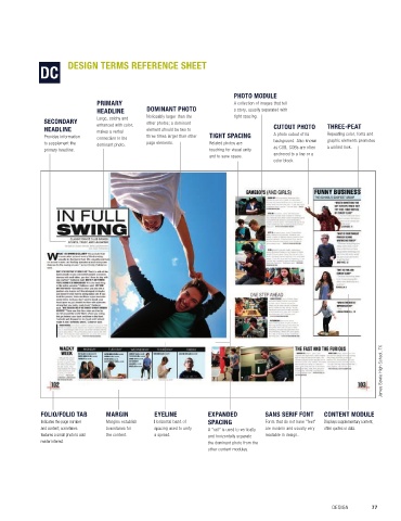
 Experienced designers know that space is a powerful   A graphic technique incorporated into a design at least
 tool, if strategically planned. In addition to maintaining   three times for visual unity.
 a consistent framing margin around the spread, three                   PHOTO MODULE
 levels of spacing provide flexibility:   TRIADIC  PRIMARY   DOMINANT PHOTO  A collection of images that tell
   ■  Standard spacing, generally 1 pica, is the default   HEADLINE   Noticeably larger than the    a story, usually separated with
                                                                        tight spacing.
                               Large, catchy and
 spacing used for consistency. The use of a column   Consists of three colors that are equally spaced on   SECONDARY   enhanced with color;   other photos; a dominant   CUTOUT PHOTO  THREE-PEAT
 grid guarantees consistent, standard spacing   the color wheel, forming an equilateral triangle. Triadic   HEADLINE  makes a verbal   element should be two to       TIGHT SPACING   A photo cutout of its   Repeating color, fonts and
                                              three times larger than other
               Provides information
 between content elements if they start and stop   color harmonies tend to be quite vibrant, even if you   to supplement the   connection to the   page elements.  Related photos are   background. Also known   graphic elements promotes
                               dominant photo.
 on the columns.   use pale or unsaturated versions of your hues. To use   primary headline.  touching for visual unity   as COB, COBs are often   a unified look.
 a triadic harmony successfully, the colors should be            and to save space.  anchored to a line or a
   ■  Tight spacing, generally 1 to 6 points, is often   carefully balanced—let one color dominate and use the   color block.
 used between photos or other related elements for   two others for accent.
 visual unity and to save space.
   ■  Expanded spacing, generally a “rail” of 3 to 6   TYPOGRAPHIC DESIGN
 picas, is used to separate or isolate content from
 the rest of the content on the spread.  A design style that places emphasis on the creative
 use of typography to deliver a story. Because yearbook
 TEMPLATE   readers prefer photography, typographic designs are
 used in a limited way for special impact.
 Master pages that help maintain consistency within a
 design or section by providing a design, but lacking   WHITE SPACE
 finished text and photos. Templates can be original
 designs created by the yearbook staff or predesigned   An unoccupied part of a design; so named because
 by Jostens as part of the Page Surfer collection.  the white background is visible. All white space should
 be planned and includes margins, interior spacing
 and rails.


                                                                                                                      James Bowie High School, TX


             FOLIO/FOLIO TAB     MARGIN         EYELINE          EXPANDED         SANS SERIF FONT   CONTENT MODULE
             Indicates the page number    Margins establish    Horizontal band of   SPACING   Fonts that do not have “feet”    Displays supplementary content,
             and content; sometimes   boundaries for    spacing used to unify   A “rail” is used to vertically   are modern and usually very   often quotes or data.
             features a small photo to add   the content.  a spread.  and horizontally separate   readable in design.
             reader interest.                                    the dominant photo from the
                                                                 other content modules.


 Aimee Roberts: Franklin High School, NC


 76  SECTION 4.1                                                                                      DESIGN       77

