Page 79 - Jostens Yearbook_Adviser Guide
P. 79
BALANCE

                      It is important to keep page elements in balance. An element placed on the left side should be balanced by the
 4.1  ELEMENTS OF DESIGN   right. Even distribution of the weight of page elements provides stability.

                      SPACE

                      Space is a design principle derived from the visual arts. It refers to the distance between, around, above, below,
 The best yearbook layouts adhere to the four basic principles   or within elements. It includes both positive and negative space.
 of graphic design: proximity, alignment, repetition and contrast.
 While these four are generally considered the standard, two

 others—balance and space—may also be taken into account.


 PROXIMITY

 The concept of proximity seeks to establish relationships between page elements. It is
 used like punctuation in writing. Tight spacing (less than one pica) between elements is
 like a period—elements separated by tight space relate to one another. Wide spacing
 (more than two picas) is like a paragraph return—elements separated by wide space
 address different topics. A combination of spacing widths creates visual connections
 and improves the readability of design.

 ALIGNMENT

 One of the techniques needs to keep the others in line, and alignment, quite literally,
 does just that. Alignment establishes order and organization within a spread to create
 connection and uniformity.

 REPETITION

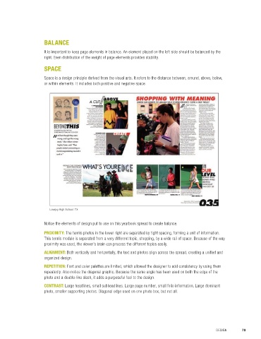
                        Lovejoy High School. TX
 Purposeful design includes the repetition of various page elements: colors, shapes,
 modules, text and text treatments. It establishes consistency by creating an association
 between page elements, strengthening design and building a feeling of rhythm within    Notice the elements of design put to use on this yearbook spread to create balance.
 the page.
                      PROXIMITY: The tennis photos in the lower right are separated by tight spacing, forming a unit of information.
 CONTRAST             This tennis module is separated from a very different topic, shopping, by a wide rail of space. Because of the way
                      proximity was used, the viewer’s brain can process the different topics easily.
 Contrast emphasizes the difference between two or more elements. It can be seen in
 a number of ways from color and shade to size and weight. Contrast creates striking   ALIGNMENT: Both vertically and horizontally, the text and photos align across the spread, creating a unified and
 differences that draw in the reader’s eye and highlight key elements of the page design.   organized design.
                      REPETITION: Font and color palettes are limited, which allowed the designer to add consistency by using them
                      repeatedly. Also notice the diagonal graphic. Because the same angle has been used on both the edge of the
                      photo and a double-line slash, it adds a purposeful feel to the design.

                      CONTRAST: Large headlines, small subheadlines. Large page number, small folio information. Large dominant
                      photo, smaller supporting photos. Diagonal edge used on one photo box, but not all.


 78  SECTION 4.1   ELEMENTS OF DESIGN                                                                 DESIGN       79

