Page 84 - Jostens Yearbook_Adviser Guide
P. 84
STEP TWO
Select a dominant photo. In general, the strongest
image should be chosen—taking into account technical
quality and storytelling power.
4.2 DESIGNING The dominant image is the first thing placed on the
page and serves as a focal point. It is noticeably larger,
YEARBOOK PAGES and often placed near the center of the page design,
carefully crossing the gutter.
Yearbook design is an organized process that follows standard
principles for design and adapts them to the unique form of STEP THREE
Direct the reader’s eye. The dominant photo determines
scholastic journalism and yearbook publication. the placement of a horizontal eyeline, which appears
somewhere above or below exact center and crosses
STEP ONE the page gutter. All other page elements placed either
above or below the eyeline.
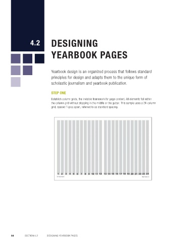
Establish column grids, the invisible framework for page content. All elements fall within
the column grid without stopping in the middle or the gutter. This sample uses a 24-column Create a dominant module that directs eyeflow toward
grid, spaced 1-pica apart, referred to as standard spacing. the headline, strategically pulling the reader into
the story.
STEP FOUR
Place additional photos. Secondary photos contrast
the dominant module using a variety of modular
shapes and sizes.
Maintain the eyeline and follow the column grid, and
use consistent standard spacing between elements.
A rail of expanded spacing may also be used.
STEP FIVE
Add captions. Captions should be placed within the
column grid, to the outside rather than between the
photos, appearing adjacent to the photos they describe
to avoid confusion.
Maintain a consistent width for the captions. Combining
two columns is standard spacing.
84 SECTION 4.2 DESIGNING YEARBOOK PAGES DESIGN 85

