Page 81 - Jostens Yearbook_Adviser Guide
P. 81
10 WAYS TO ACHIEVE CONTRAST

                      If rule of thirds is the student favorite in photo composition, then contrast could rival its popularity in design.
 DESIGN PRINCIPLES    Adolescents are already such black and white thinkers, that seeing things as either/or comes naturally. Not only
                      is contrast easy to understand, there are a number of simple ways to integrate it into your design. Be careful,
                      though. A design that incorporates all 10 of these without consistency would be hard to look at. Notice that each
                      of the yearbook spreads below utilize the concept of three-peat as a partner to contrast.

 PROXIMITY            HERE ARE 10 WAYS TO ADD CONTRAST TO DESIGNS:
 The concept of proximity seeks to establish   1.  Apply contrast by using opposing colors in design. Simply put, dark vs. light. More specific: use
 relationships between page elements. Items in close   complementary colors, colors opposite from one another on the color wheel. Or triadic colors: three colors
 proximity are related, while items spaced further away   VS
 imply difference. When items are grouped together,   equally spaced on the color wheel.
 they should be visually connected in some way.
                        2.  Vary text weight to create contrast. Contrast a light text weight with heavier, more bold weight.
 ALIGNMENT              3.  Use white space. Large areas of empty, or negative, space draw emphasis to smaller elements within
                           them, just as small white spaces draw notice in larger content elements.
 One of the techniques needs to keep the others in line,
 and alignment, quite literally, does just that. Alignment   VS  4.  Contrast using a different color hue. In monochromatic (one-color) design, use a variety of shades
 establishes order and organization within a spread,   for emphasis.
 creating connection and uniformity.
                        5.  Apply contrast with shape by opposing hard and soft. Rounded edges differ from those with sharp edges
                           and corners.
 REPETITION
                        6.  In text or other design elements, contrast can be created using size and scale.
 Purposeful design includes the repetition of various
 page elements: colors, shapes, modules, text and text   7.  Consider using a variety of text justification: right, left, center.
 treatments. It establishes consistency by creating an
 association between page elements, strengthening   8.  Apply contrast by creating a break or alternating the rhythm of a repeating pattern.
 design and building a feeling of rhythm within    9.  Sans serif and serif fonts (fonts with or without tails) can create contrast.
 the page.
 CONTRAST              10.  Object orientation can be used for contrast. Juxtapose horizontal with vertical placement of elements to
                           add emphasis on the element that is different.
 Contrast emphasizes the difference between two or
 more elements. It can be seen in a number of ways from
 color and shade to size and weight. Contrast creates
 striking differences that draw in the reader’s eye and
 highlight key elements of the page design.
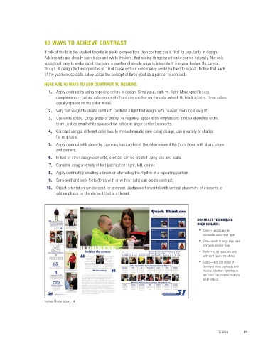
                                                                                             CONTRAST TECHNIQUES
 BALANCE                                                                                     USED INCLUDE:
 It is important to keep page elements in balance.                                              ■  Color—specific words
 An element placed on the left side should be balanced                                          contrasted using blue type
 by the right. Even distribution of the weight of page                                          ■  Size—words in large type used
 elements provides stability.                                                                   alongside smaller type
                                                                                                ■  Style—script type contrasts
                                                                                                with serif type in headlines
 SPACE                                                                                          ■  Space—size and shape of
 Space is a design principle derived from the visual arts.                                      dominant photo contrasts with
 It refers to the distance between, around, above,                                              module in bottom right that is
 below, or within elements. It includes both positive                                           the same size, but has multiple
 and negative space.                                                                            small images.


 © 2018 by Jostens, Inc. All Rights Reserved.

                      Holmes Middle School, MI


 80  SECTION 4.1   ELEMENTS OF DESIGN                                                                 DESIGN       81

