
Page 366 - Foundations of Marketing
P. 366
Pricing Concepts and Management | Chapter 12 333
Demand Curves
For most products, demand and price are inversely related. This means that the quantity
demanded goes up as the price goes down and vice versa. Think about your own spending
habits. You are probably more likely to purchase a product, such as the Amazon Kindle
e-reader, after competition has helped to drive its price down. You also may be inclined to
stock up on your favorite brand of cereal or tennis shoes during a good sale because the
price is lower. As long as the marketing environment and buyers’ needs, ability (purchasing
power), willingness, and authority to buy remain stable, this fundamental inverse relation-
ship holds.
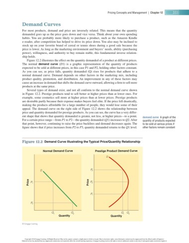
Figure 12.2 illustrates the effect on the quantity demanded of a product at different prices.
The normal demand curve ( D 1) is a graphic representation of the quantity of products
expected to be sold at different prices, in this case P 1 and P 2 , holding other factors constant.
As you can see, as price falls, quantity demanded (Q) rises for products that adhere to a
normal demand curve. Demand depends on other factors in the marketing mix, including
product quality, promotion, and distribution. An improvement in any of these factors may
cause an increase in demand that shifts the demand curve outward, allowing a fi rm to sell more
products at the same price.
Several types of demand exist, and not all conform to the normal demand curve shown
in Figure 12.2 . Prestige products tend to sell better at higher prices than at lower ones. For
example, some cosmetics sell more at higher prices than at lower prices. Prestige products
are desirable partly because their expense makes buyers feel elite. If the price fell drastically,
making the products affordable for a large number of people, they would lose some of their
appeal. The demand curve on the right side of Figure 12.2 shows the relationship between
price and quantity demanded for prestige products. As you can see, the curve has a very differ-
ent shape that shows that quantity demanded is greater, not less, at higher prices—to a point.
demand curve A graph of the
For a certain price range—from P 1 to P 2—the quantity demanded ( Q 1) increases to Q 2. After quantity of products expected
that point, however, continuing to raise the price backfi res and demand decreases again. The to be sold at various prices if
fi gure shows that if price increases from P 2 to P 3, quantity demanded returns to the Q 1 level. other factors remain constant
Figure 12.2 Demand Curve Illustrating the Typical Price/Quantity Relationship
Normal Demand Curve Prestige Product Demand Curve
D
D P 3
Price P 1 Price P 2
P 1
P 2
Q Q Q Q
1 2 1 2
Quantity Quantity
© Cengage Learning
Copyright 2014 Cengage Learning. All Rights Reserved. May not be copied, scanned, or duplicated, in whole or in part. Due to electronic rights, some third party content may be suppressed from the eBook and/or eChapter(s).
Editorial review has deemed that any suppressed content does not materially affect the overall learning experience. Cengage Learning reserves the right to remove additional content at any time if subsequent rights restrictions require it.