
Page 706 - Environment: The Science Behind the Stories
P. 706
How to Interpret Graphs B
APPENDIX
Presenting data in ways that help make trends and patterns In many cases, independent variables are not numbers, but
visually apparent is a vital element of science. For scientists, categories. For example, in a graph that presents population
businesspeople, policymakers, and others, the primary tool for sizes of several nations, the nations would comprise a categori-
expressing patterns in data is the graph. Thus, the ability to cal independent variable, whereas population size would be a
interpret graphs is a skill that you will want to cultivate. This numerical dependent variable.
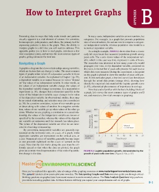
appendix guides you in how to read graphs, introduces a few As a simple example, FIGURE B.1 shows data from a classic
vital conceptual points, and surveys the most common types of early lab experiment that measured population growth among
graphs, giving rationales for their use. yeast cells. The x-axis shows values of the independent vari-
able, which in this case was time, expressed in units of hours.
Navigating a Graph The researcher was interested in how many yeast cells would
propagate over time, so the dependent variable, presented on
A graph is a diagram that shows relationships among variables, the y-axis, is the number of yeast cells present. For each hour at
which are factors that can change in value. The most common which data were measured during the experiment, a data point
types of graphs relate values of a dependent variable to those on the graph is plotted to show the number of yeast cells pre-
of an independent variable. As explained in Chapter 1 (p. 29), sent. In this particular graph, a line (red curve) was then drawn
a dependent variable is so named because its values "depend through the actual data points (orange dots), showing how
on" the values of an independent variable. In other words, as closely the empirical data matched the logistic growth curve
the values of an independent variable change, the values of (p. 85), a theoretical phenomenon of importance in ecology.
the dependent variable change in response. In a manipulative Now that you're familiar with the basic building blocks of
experiment (p. 30), changes that a researcher specifies in the a graph, let's survey the most common types of graphs you'll
value of the independent variable cause changes in the value see, and examine a few vital concepts in graphing.
of the dependent variable. In observational studies, there may
be no causal relationship, and scientists may plot a correlation
(p. 30). In a positive correlation, values of one variable go up Value of Data point
or down along with values of another. In a negative correla- y = 450 cells
tion, values of one variable go up when values of the other go 800
down. Whether we are graphing a correlation or a causal rela- y-axis
tionship, the values of the independent variable are known or 600
specified by the researcher, whereas the values of the depend-
ent variable are unknown until the research has taken place. Population size (number of cells) 400
The values of the dependent variable are what we are inter-
ested in observing or measuring. 200 Value of
x = 8.8 hours
By convention, independent variables are generally rep-
resented on the horizontal axis, or x-axis, of a graph, while 0
dependent variables are represented on the vertical axis, or Dependent 0 3 6 9 12 15 18 21
y-axis. Numerical values of variables generally become larger variable Time (hours)
as one proceeds rightward on the x-axis or upward on the x-axis
y-axis. Note that the tick marks along the axes must be uni- Independent Units of
variable
measurement
formly spaced so that when the data are plotted, the graph
gives an accurate visual representation of the scale of quantita- FIGURE B.1 Logistic population growth, demonstrated by the
tive change in the data. growth of yeast cells over time. (Figure 3.19a, p. 87) H O W T O INTERPRET GRAPH S
Once you’ve explored this appendix, take advantage of the graphing resources at www.masteringenvironmentalscience.com.
The tutorials allow you to plot your own data. The Interpreting Graphs and Data exercises guide you through critical-
thinking questions on graphed data from recent research in environmental science. The Data Analysis Questions help you hone
your skills in reading graphed data. All these features will help you expand your comprehension and use of graphs.
B-1
Z02_WITH7428_05_SE_AppB.indd 1 13/12/14 10:51 AM