Page 708 - Environment: The Science Behind the Stories
P. 708

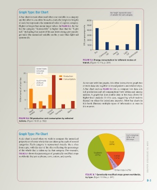
Graph Type: Bar Chart                                                       Bar height represents value
                                                                                                    of variable for each category
                        A bar chart is most often used when one variable is a category
                        and the other is a number. In such a chart, the height (or length)   6000
                        of each bar represents the numerical value of a given category.
                        Higher or longer bars mean larger values. In FIGURE B.5, the bar   5000
                        for the category "Automobile" is higher than that for "Light   4000
                        rail," indicating that automobiles use more energy per passen-
                        ger-mile (the numerical variable on the y-axis) than light rail   BTU per passenger-mile  3000
                        systems do.                                              2000


                                                                                 1000
                                                                                   0
                                                                                           Commuter rail  rail    rail Automobile
                                                                                       Bus             Heavy   Light

                                                                             FIGURE B.5 Energy consumption for different modes of
                                                                             transit. (Figure 13.11a, p. 364)


                                       United States
                                       consumes
                            20         more oil
                                                             Production      As we saw with line graphs, it is often instructive to graph two
                          Million barrels of oil per day  10  more oil       or more data sets together to reveal patterns and relationships.
                                                             Consumption
                                       Saudi Arabia
                            15
                                       produces
                                                                             A bar chart such as FIGURE B.6 lets us compare two data sets
                                                                             (oil production and oil consumption) both within and among
                                                                             nations. A graph that does double duty in this way allows for
                                                                             higher-level analysis (in this case, suggesting which nations
                             5
                                                                             depend on others for petroleum imports). Most bar charts in
                                                                             this book illustrate multiple types of information at once in
                                                                             this manner.
                             0
                                 Saudi    Iran  United  Germany  Japan
                                                  States
                                  Arabia
                        FIGURE B.6 Oil production and consumption by selected
                        nations. (Figure 19.20, p. 562)


                        Graph Type: Pie Chart                                                                    Corn comprises
                                                                                                                 32% of all
                        A pie chart is used when we wish to compare the numerical                                GM crops
                        proportions of some whole that are taken up by each of several             Corn
                        categories. Each category is represented visually like a slice             (32%)
                        from a pie, with the size of the slice reflecting the percentage
                        of the whole that is taken up by that category. For example,
                        FIGURE B.7 shows the percentages of genetically modified crops   Soybeans
                        worldwide that are soybeans, corn, cotton, and canola.         (47%)           Cotton
                                                                                                       (14%)                      H O W T O INTERPRET GRAPH S


                                                                                                   Canola (5%)
                                                                                                       Other crops (<2%)
                                                                               FIGURE B.7 Genetically modified crops grown worldwide,
                                                                               by type. (Figure 10.26a, p. 281)
                                                                                                                                  B-3


           Z02_WITH7428_05_SE_AppB.indd   3                                                                                    13/12/14   10:51 AM
   703   704   705   706   707   708   709   710   711   712   713