
Page 707 - Environment: The Science Behind the Stories
P. 707
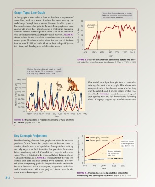
Graph Type: Line Graph                                                   Yearly data show an increase in ozone
                                                                                              hole size before the Montreal Protocol,
                     A line graph is used when a data set involves a sequence of              and stabilization afterwards
                     some kind, such as a series of values that occur one by one   30
                     and change through time or across distance. In a line graph, a
                     line runs from one data point to the next. Line graphs are most   25  Montreal
                                                                                 Protocol
                     appropriate when the y-axis expresses a continuous numerical
                     variable, and the x-axis expresses either continuous numerical   20
                     data or discrete sequential categories (such as years). FIGURE B.2   Millions of sq km  15
                     shows values for the size of the ozone hole over Antarctica in
                     recent years. Note how the data show that the size of the hole   10
                     increases until 1987, when the Montreal Protocol (p. 490) came   5
                     into force, and then begins to stabilize afterwards.
                                                                             0
                                                                              1979    1985  1990   1995  2000  2005   2010
                                                                                                    Year
                                                                          FIGURE B.2 Size of the Antarctic ozone hole before and after
                                                                          a treaty that was designed to address it. (Figure 17.27, p. 490)


                                Plotting these two data sets together reveals
                                that they rise and fall in tandem and suggests
                                that they may influence one another

                       160,000
                                                                                   One useful technique is to plot two or more data
                       140,000
                       Numbers of hares and lynx  100,000  Hare     Lynx           may be related, and if so, the nature of that rela-
                                                                                   sets together on the same graph. This allows us to
                       120,000
                                                                                   compare trends in the data sets to see whether they
                                                                                   tionship. In FIGURE B.3, recorded numbers of a pred-
                        80,000
                                                                                   ator species rise and fall immediately following
                        60,000
                                                                                   those of its prey, suggesting a possible  connection.
                        40,000
                        20,000

                            0
                               1850 1860 1870 1880 1890 1900 1910 1920 1930 1940
                                                       Year
                     FIGURE B.3 Fluctuations in recorded numbers of hare and lynx
                     in Canada. (Figure 4.4, p. 96)


                     Key Concept: Projections                                8      Developing countries

                     Besides showing observed data, graphs can show data that are   Developed countries       Projected future
                     predicted for the future. Such projections of data are based on   6                      data are plotted
                     models, simulations, or extrapolations from past data, but they                          as a dashed line
                     are only as good as the information that goes into them—and   Global population (billions)  4
                     future trends may not hold if conditions change in unforeseen                 Known past data
                                                                                                   are plotted as a
                     ways. Thus, in this textbook, projected future data are shown                 solid line
                     with dashed lines, as in FIGURE B.4, to indicate that they are less   2
                     certain than data that have already been observed. Be care-
                     ful when interpreting graphs in the popular media and on the   0
                     Internet, however; often newspapers, magazines, web sites,   1950  1975  2000    2025    2050
                     and advertisements will show projected future data in the                Year
                     same way as known past data!                         FIGURE B.4 Past and projected population growth for
                                                                          developing and developed countries. (Figure 8.21, p. 225)
              B-2


           Z02_WITH7428_05_SE_AppB.indd   2                                                                                    13/12/14   10:51 AM