
Page 709 - Environment: The Science Behind the Stories
P. 709
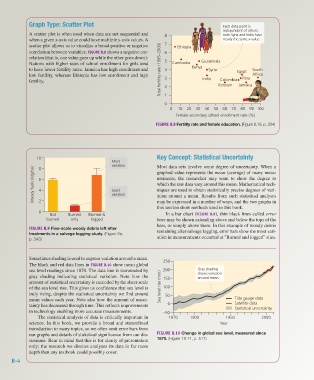
Graph Type: Scatter Plot                                                        Each data point is
                                                                                                     independent of others;
                     A scatter plot is often used when data are not sequential and   8               note Syria and India have
                     when a given x-axis value could have multiple y-axis values. A                  nearly the same x-value
                     scatter plot allows us to visualize a broad positive or negative   7  Ethiopia
                     correlation between variables. FIGURE B.8 shows a negative cor-  6
                     relation (that is, one value goes up while the other goes down):
                     Nations with higher rates of school enrollment for girls tend   5  Cambodia  Guatemala
                     to have lower fertility rates. Jamaica has high enrollment and   Total fertility rate (1995–2000)  4  Kenya  Syria  Egypt  South
                     low fertility, whereas Ethiopia has low enrollment and high                                 Africa
                                                                                                             Peru
                                                                                                    Colombia
                     fertility.                                              3 2            India  Vietnam  Jamaica


                                                                             0 1
                                                                               0  10  20  30  40  50  60  70  80  90 100
                                                                                 Female secondary school enrollment rate (%)
                                                                         FIGURE B.8 Fertility rate and female education. (Figure 8.19, p. 224)


                        10                                                Key Concept: Statistical Uncertainty
                                                       Most
                                                       variation          Most data sets involve some degree of uncertainty. When a
                       Woody fuels (Mg/ha)  6          Least              urements, the researcher may want to show the degree to
                         8
                                                                          graphed value represents the mean (average) of many meas-
                                                                          which the raw data vary around this mean. Mathematical tech-
                                                                          niques are used to obtain statistically precise degrees of vari-
                         4
                                                       variation
                                                                          ation around a mean. Results from such statistical analyses
                         2
                                                                          may be expressed in a number of ways, and the two graphs in
                                                                          this section show methods used in this book.
                         0
                             Not     Burned  Burned &                        In a bar chart (FIGURE B.9), thin black lines called error
                            burned    only    logged                      bars may be shown extending above and below the tops of the
                                                                          bars, or simply above them. In this example of woody debris
                     FIGURE B.9 Fine-scale woody debris left after
                     treatments in a salvage logging study. (Figure 2a,   remaining after salvage logging, error bars show the most vari-
                     p. 343)                                              ation in measurements occurred at "Burned and logged" sites.


                     Sometimes shading is used to express variation around a mean.
                     The black and red data lines in FIGURE B.10 show mean global   250
                     sea level readings since 1870. The data line is surrounded by   200  Gray shading
                     gray shading indicating statistical variation. Note how the   150    shows variation
                                                                                          around mean.
                     amount of statistical uncertainty is exceeded by the sheer scale
                     of the sea level rise. This gives us confidence that sea level is   Sea level rise (mm)  100
                     truly rising, despite the statistical uncertainty we find around   50
                     mean values each year. Note also how the amount of uncer-                            Tide gauge data
                     tainty has decreased through time. This reflects improvements   0                    Satellite data
                     in technology enabling more accurate measurements.     –50                           Statistical uncertainty
                        The statistical analysis of data is critically important in   1870  1900      1950           2000
                     science. In this book, we provide a broad and streamlined                      Year
                     introduction to many topics, so we often omit error bars from
                     our graphs and details of statistical significance from our dis-  FIGURE B.10 Change in global sea level, measured since
                     cussions. Bear in mind that this is for clarity of presentation   1870. (Figure 18.14, p. 517)
                     only; the research we discuss analyzes its data in far more
                     depth than any textbook could possibly cover.
              B-4


           Z02_WITH7428_05_SE_AppB.indd   4                                                                                    13/12/14   10:51 AM