
Page 168 - BA2 Integrated Workbook - Student 2017
P. 168
Chapter 11
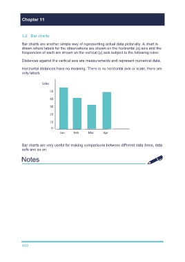
3.2 Bar charts
Bar charts are another simple way of representing actual data pictorially. A chart is
drawn where labels for the observations are shown on the horizontal (x) axis and the
frequencies of each are shown on the vertical (y) axis subject to the following rules:
Distances against the vertical axis are measurements and represent numerical data.
Horizontal distances have no meaning. There is no horizontal axis or scale, there are
only labels.
Sales
50
40
30
20
10
0
Jan Feb Mar Apr
Bar charts are very useful for making comparisons between different data items, data
sets and so on.
Go through illustrations 5 and 6
Try TYU 5
160