
Page 167 - BA2 Integrated Workbook - Student 2017
P. 167
Risk 1: summarising and analysing data
Charts and diagrams
Many people find it easier to understand numerical information
if it is presented in a pictorial form, rather than as a table of
figures.
There are a number of simple charts and graphs commonly used to represent
business data.
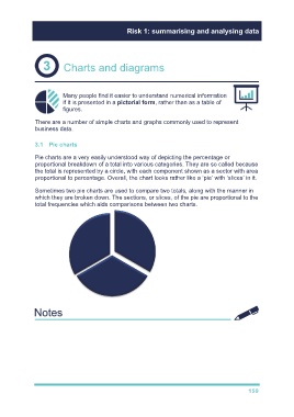
3.1 Pie charts
Pie charts are a very easily understood way of depicting the percentage or
proportional breakdown of a total into various categories. They are so called because
the total is represented by a circle, with each component shown as a sector with area
proportional to percentage. Overall, the chart looks rather like a ‘pie’ with ‘slices’ in it.
Sometimes two pie charts are used to compare two totals, along with the manner in
which they are broken down. The sections, or slices, of the pie are proportional to the
total frequencies which aids comparisons between two charts.
Go through illustration 4
Try TYU 4
159