
Page 169 - BA2 Integrated Workbook - Student 2017
P. 169
Risk 1: summarising and analysing data
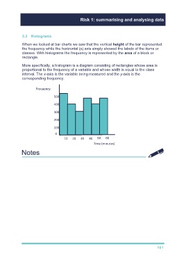
3.3 Histograms
When we looked at bar charts we saw that the vertical height of the bar represented
the frequency while the horizontal (x) axis simply showed the labels of the items or
classes. With histograms the frequency is represented by the area of a block or
rectangle.
More specifically, a histogram is a diagram consisting of rectangles whose area is
proportional to the frequency of a variable and whose width is equal to the class
interval. The x-axis is the variable being measured and the y-axis is the
corresponding frequency.
Frequency
500
400
300
200
100
0
10 20 30 40 50 60
Time (minutes)
Go through illustration 7
161