Page 62 - Process Book Abdul Raffai Waqar
P. 62
PROTOTYPING PHASE

                                                                                                                                                                                                             Ch 05
                Mid Fidelity Prototype &  User Feedback - Mobile App

                Clickable Prototype User Feedback


                     AirAlign Mobile Application
                                                                                                                       Rationale
                     a.  Clickable Grayscale Figma Prototype
                     Process Steps
                                                                                                                       I conducted user feedback and collected responses on clickable
                     1.  Explain how the Figma prototype works.
                     2.  Receive qualitative feedback on the functional module.
                                                                                                                       figma prototype to identify any missing solution factors in the
                     3.  Identify action points and apply feedback for High-Fidelity Prototype.

                                                                                                                       design, check if the app design is solving the problem and recieve
                            Questions         ET1       ET2        BT1       BT2       HT1        HT2
                                                                                                                       possible improvements.
                     Is the login process easy and
                                              Yes        Yes       Yes       Yes    Yes it is complete   Yes
                     complete?
                                                                                                                       Process
                     Is the Homepage easy to   Yes, but the hotel                    Yes I can find
                                                       Yes it is all      Yes, with colours it   them and it is
                     understand? Are you able to find   icon could be   Yes                       Yes
                                                       available          should be clearer   easy to
                     the relevant urgent information?   updated.
                                                                                      understand
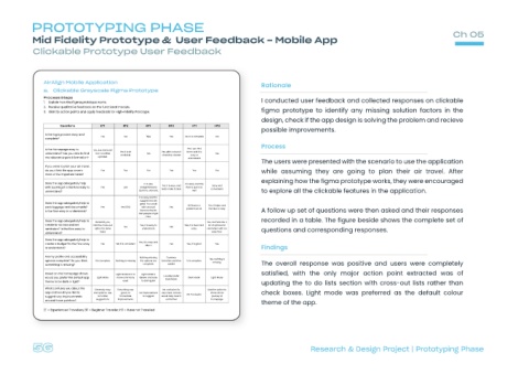
                                                                                                                       The users were presented with the scenario to use the application
                     If you were to plan your air travel,
                     do you think the app covers   Yes   Yes       Yes       Yes        Yes       Yes
                                                                                                                       while assuming they are going to plan their air travel. After
                     most of the important tasks?
                                                                                                                       explaining how the figma prototype works, they were encouraged
                     Does the app adequately help
                                                                  It is very        It is easy and the
                                                                          Yes it is easy and     Easy and
                     with bookings? Is the flow easy to   Yes   yes   straightforward.   flow is quick as
                                                                          texts make it clear   convenient.
                                                                Quick to onboard.       well                           to explore all the clickable features in the application.
                     understand?
                                                                It is easy and the
                                                                suggestions are
                     Does the app adequately help to            good. You could
                                                                                      All Good, no   Yes, it helps and
                     pack luggage and documents?   Yes   Yes 100%   add unusual   Yes
                                                                                     problem at all.   the flow is easy
                     Is the flow easy to understand?            items to the list                                      A follow up set of questions were then asked and their responses
                                                               that people might
                                                                   miss.
                     Does the app adequately help to                                                                   recorded in a table. The figure beside shows the complete set of
                                            Generally yes,                                    Yes, as there are a
                     create to-do lists and set   Add the cross-out   Yes, it is easy to   Yes, it is clear and   lot of options for
                                                         Yes                 Yes
                     reminders? Is the flow easy to   option for done   understand.    easy.   reminders with an       questions and corresponding responses.
                                              tasks                                             easy flow.
                     understand?
                     Does the app adequately help to
                                                                Yes, it is easy and
                     create a budget? Is the flow easy   Yes   Yes it is consistent   Yes   Yes, it is good.   Yes.
                                                                  direct.
                     to understand?                                                                                    Findings
                     Are my profile and accessibility           Nothing missing,   Currency
                                                                                               Yes, nothing is
                     options complete? Do you think   It is Complete   Nothing is missing   the options are   Selection could be   It Is complete
                                                                                                 missing.              The overall response was positive and users were completely
                     something is missing?                       complete.   added
                     Based on the homepage shown,    Light Mode as it is   Light Mode is                               satisfied, with the only major action point extracted was of
                                                                           I usually prefer
                     would you prefer the default app   Light Mode   more commonly   clearer and easy   Dark Mode   Light Mode
                                                                            Dark Mode
                     theme to be dark or light?         used     to distinguish
                                                                                                                       updating the to do lists section with cross-out lists rather than
                     What confuses you about the
                                            Generally easy   Everything was   No confusion its   Add the option to
                     app and would you like to   and quick to use,   good, no   No improvement   very clear, colours   share whole   check boxes. Light mode was preferred as the default colour
                                                                                     No Confusion
                     suggest any improvements   no further   immediate   to suggest   would help clear it   journey at
                                            suggestions   improvements      out further         homepage
                     around those pointers?
                                                                                                                       theme of the app.

                     ET = Experienced Travellers, BT = Beginner Traveller, HT = Have not Travelled
                                                                                                                                             Research & Design Project | Prototyping Phase

