Page 69 - manual_V5_11_9_2018_Html5
P. 69
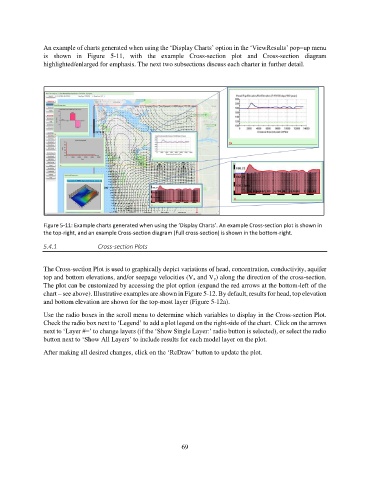
An example of charts generated when using the ‘Display Charts’ option in the ‘ViewResults’ pop=up menu
               is  shown  in  Figure  5-11,  with  the  example  Cross-section  plot  and  Cross-section  diagram
               highlighted/enlarged for emphasis. The next two subsections discuss each charter in further detail.


               Figure 5-11: Example charts generated when using the ‘Display Charts’. An example Cross-section plot is shown in
               the top-right, and an example Cross-section diagram (Full cross-section) is shown in the bottom-right.
               5.4.1             Cross-section Plots


               The Cross-section Plot is used to graphically depict variations of head, concentration, conductivity, aquifer
               top and bottom elevations, and/or seepage velocities (Vx and Vy) along the direction of the cross-section.
               The plot can be customized by accessing the plot option (expand the red arrows at the bottom-left of the
               chart – see above). Illustrative examples are shown in Figure 5-12. By default, results for head, top elevation
               and bottom elevation are shown for the top-most layer (Figure 5-12a).
               Use the radio boxes in the scroll menu to determine which variables to display in the Cross-section Plot.
               Check the radio box next to ‘Legend’ to add a plot legend on the right-side of the chart.  Click on the arrows
               next to ‘Layer #=’ to change layers (if the ‘Show Single Layer:’ radio button is selected), or select the radio
               button next to ‘Show All Layers’ to include results for each model layer on the plot.

               After making all desired changes, click on the ‘ReDraw’ button to update the plot.


                                                             69

