
Page 51 - Computer Basics- Student Textbook
P. 51
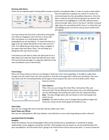
Working with Charts
              Charts are an important part to being able to create a visual for spreadsheet data. In order to create a chart within
                                                                 Excel the data that is going to be used for it needs to be
                                                                 entered already into the spreadsheet document. Once the
                                                                 data is entered, the cells that are going to be used for the
                                                                 chart need to be highlighted so that the software knows
                                                                 what to include. Next, click on the Insert Tab that is located
                                                                 right above the spreadsheet (left). Once it is clicked the tab
                                                                 will highlight green and all the various charts within Excel
                                                                 will appear.

              You may choose the chart that is desired by clicking the
              icons that are displayed. Once the icon is chosen the
              chart will appear as a small graphic within the
              spreadsheet you are working on. To move the chart to a
              page of its own select the border of the chart and Ctrl >
              Click. This will bring up a drop-down menu, navigate to
              the option that says Move Chart. This will bring up a
              dialog box that says Chart Location.

              From here you will need to select the circle next to As A
              New Sheet and name the sheet that will hold your chart.
              The chart will pop up larger in a separate sheet but in the
              same workbook as your entered data.


              Chart Design
              There are various features that you can change to make your chart more appealing. To be able to make these
              changes you will need to have the chart selected or view the chart page that is within your workbook. Once you
              have done that the Formatting Palette will change to show features that were not there before (left). These
                                                  features include:

                                                  Chart Options:
                                                  Titles: Here you can change the Chart Title, Vertical Axis Title, and
                                                  Horizontal Axis Title by clicking the drop-down menu and selecting which
                                                  one you will change and entering the name into the empty box below.
                                                  Axes:  You may change which axes are shown on the charts graph and
                                                  which are not.
                                                  Gridlines: This feature allows you to change which gridlines (major and
                                                  minor) are shown on the charts graph and which are not.

              Chart Style:
              Here you can change the color of the bars that are within your chart.
              Quick Styles and Effects:
              Here you can add gradients, fill, drop shadows, and reflections to your chart depending on what is desired.

              Inserting Smart Art Graphics
              Graphics
              Smart Art Graphics are pre-made graphics that can be inserted into a spreadsheet or workbook to display
              relationships, cycles, diagrams, pyramids, and lists. These graphics do not require or use pre-entered data from
              your spreadsheets. All information that is going to be entered them will be entered by hand. To insert a Smart Art
                                                                 50