
Page 4 - graphic standards Demo
P. 4
The History of the Region’s
Image
Over the past century and a half, the geographic entity recognized as the County of Waterloo or the Region of Waterloo has had an evolution of representative symbols, seals, crests and coats of arms. From the pastoral scenes of the lion and the lamb to the stylized ’70’s “W”, the Region of Waterloo has chosen symbols that reflect its wonderful diversity and unique identity. Whether representing a citizen of Cambridge, Kitchener, North Dumfries, Wilmot, Waterloo, Wellesley, or Woolwich, the symbols of the Region have attempted to reach out and consolidate the ideals of a community of communities in a strong and bold image.
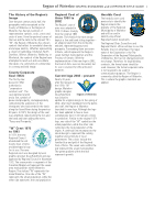
County Corporate
Seal (1853)
The first by-law
passed in 1852
authorized a
“corporate or
common seal”. The
seal depicted a lamb
and a lion, symbols of
peace and prosperity, and appropriately symbolizing the aspirations of the immigrants who had settled in the lands along the Grand River during the previous 50 years. In 1873, the design of the seal was amplified, repositioning the lion and the lamb and later adding the motto, “Peace and Prosperity.”
“W” Crest 1973
to 1993
In 1973, the new
Regional Council
abandoned the old
County Coat of Arms
and developed a logo
for its use. The new
Regional crest was designed by local graphic designer Doug Ratchford and was approved by Regional Council in November 1972. The seven points or segments of the Canadian Maple Leaf represent the seven area municipalities within Waterloo Region. The stylized “W” represents the name Waterloo. One side of the “W” represents the urban population, while the other side represents the rural population.
Regional Coat of
Arms 1993 to
2002
The Region’s coat of
arms was adopted in
1993. It draws strongly
from the original 1853
emblem. The shield of the new design depicts a lion and lamb sitting together – an allegory taken from the old County emblem, representing peace and prosperity. Surrounding them are seven trilliums, which represent the Region’s seven member municipalities and the Province of Ontario. With the implementation of the new logo in 2002, the Coat of Arms was not discarded, but its use is reserved for official Council purposes.
Current logo 2002 – present
Nearly 30 years
after the release of
the 1970s “W”
design, Waterloo
graphic designer
Doug Ratchford
was asked to
update his original design. In the spring of 2002, after much feedback from the public and staff, the Region of Waterloo launched its new logo. Although the logo has been updated to have a more contemporary feel, it still remains strong in symbolism. Similar to the original 1973 logo, one side of the “W” symbolizes the urban population, while the other side symbolizes the rural population of the region. A continual line encompasses the whole design to represent the coming together and continuity of local government. The colours include the familiar blue and gold of the Regional Coat of Arms. The seven veins within the leaf represent the seven municipalities. The green gradient within the leaf represents growth.
Heraldic Crest
The heraldic crest used previously to identify the Region remains the
property of The Regional Municipality of Waterloo and will be used to
identify only official Regional/Council documents.
The Regional Chair, Councillors and Regional Clerk’s office continue to use the Heraldic Crest on letterhead. The legal name of the Corporation is the The Corporation of the Regional Municipality of Waterloo; this has not changed and will not change. Therefore, for legal binding contracts, the formal name should be used. However, the formal corporate name is not required to be used for communication purposes. The Region is commonly called the Region of Waterloo. This is where the graphic standards are applied.
Region of Waterloo GRAPHIC STANDARDS and CORPORATE STYLE GUIDE 2
