
Page 6 - graphic standards Demo
P. 6
Region of Waterloo GRAPHIC STANDARDS and CORPORATE STYLE GUIDE 4
Version B
Infringement Boundary
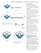
Secondary Logos
Shown here are secondary versions of the Region of Waterloo Corporate Image.
While the primary image A will be used for the majority of applications, versions B and C may be utilized for specific layout considerations.
Version B
This may be used for various applications where design considerations dictate a more horizontal format. The grid indicates proportion and spatial relationships and the infringement area. The grid is based on the square of the height of the capital ’R’ in the logotype. All colour standards would apply.
This version of the corporate graphic should not be reduced smaller than example shown on the left. Smaller sizes would affect legibility.
Version C
This basket-style format may be used for unique applications such as uniform identification, pins, or souvenirs*. Spatial relationships are indicated by the grid shown and again are based on the square of the capital ’R’ in the logotype. Infringement restrictions are indicated by the bold rule in the grid.
When configuration ’C’ is used on darker backgrounds the symbol must have a surrounding white border as shown on page 5. The border width is the same as the interior white space in the symbol. In this reverse instance the curved logotype is raised and expanded to accommodate the increased dimensions of the symbol. Depending on the background colour the logotype can appear as black or reverse (white).
*Permission is required for use of this “basket”version by contacting Corporate Communications.
The logo and logotype are not to be condensed or elongated under any circumstance.
All corporate image graphics are available from the Region of Waterloo in both Mac and PC platforms from Corporate Publishing, therefore, no manipulation or resetting is required.
These logos can be requested from the “Regional Logo Request” button found on the home page of the portal. Secondary Regional logos may also be requested here via the pull- down menu or by identifying them in the notes section.
Note: The logo and logotype may be used independent of each other in some horizontal applications. The size relationship may be altered in this usage to give increased prominence to both. The logotype would still use the Friz Quadrata typeface.
The grid is based on the square of the height of the capital letter ’R’ in the logo- type.
1/2” 1/2”
Reproduction Limitation
Infringement Boundary
Version C
The grid is based on the square of the height of the capital letter ’R’ in the logotype.
